Simplications Watchface Collection by Rajendra Serber |
Home > Winners > #56624 |
 |
|
||||
| DESIGN DETAILS | |||||
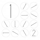
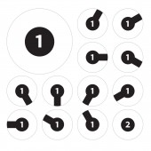
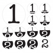
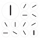
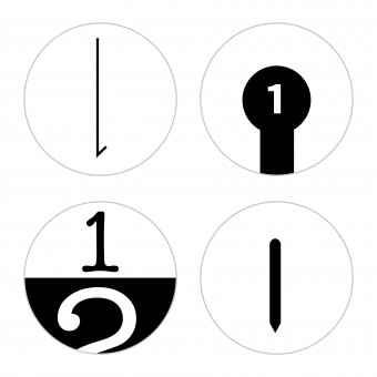
| DESIGN NAME: Simplications PRIMARY FUNCTION: Watchface Collection INSPIRATION: The Simplications design goal was to distinguish the hour and the minute by representing each with a distinct element. Focusing on the relative nature of time telling, this invention removes the need for extraneous numbers and markers when only a relative understanding of the current time needed. By paring down the markings the approximate time instantly identifiable. When looking at a watch we usually don't need microsecond precision. We just want to know how close we are to an event's beginning or end. We generally don't even need to know the exact minute. When we speak about time, we mostly use 15 minute increments: we say "quarter past," "half past," "quarter to" – even when we know the exact minute. A good feature of the traditional analog clock is that you see a relative position in time. But the similarity of the two hands adds ambiguity. In addition, always displaying all numbers from 1 to 12 adds visual noise, without correctly representing the minutes – minutes are on a scale from 0 to 59. A good feature in digital clocks is that you get the exact minute (and on some clocks the exact second.) But the fixed digits take away the relative representation of time which better matches the way we talk about time. The designs in this collection build on the best of both of these traditional ways of presenting time. UNIQUE PROPERTIES / PROJECT DESCRIPTION: Simplications is a collection of 4 watchfaces that convey the relativity of time. These patented designs present new ways of perceiving time while remaining minimal and easy to read. Unrestrained by traditional technologies they take advantage of the possibilities of modern display technology, improving the readability of the current time even on small low resolution displays found on monochrome smartwatches. OPERATION / FLOW / INTERACTION: Each of the 4 designs has distinct representation of time: "Simplication&q PROJECT DURATION AND LOCATION: This project started in 2013 as a napkin sketch in a cafe at the San Francisco International Airport. It went through development in Cleveland Ohio, Münsingen Germany and Oakland California. The collection launched in 2016 and was successfully funded on Kickstarter. FITS BEST INTO CATEGORY: Interface, Interaction and User Experience Design |
PRODUCTION / REALIZATION TECHNOLOGY: - SPECIFICATIONS / TECHNICAL PROPERTIES: Currently available for the Pebble smartwach, with display sizes of 144 by 168 or 180 by 180 pixels in black and white or 64 colors. TAGS: watchface, time, clock, watch, smartwatch, Pebble, app RESEARCH ABSTRACT: - CHALLENGE: - ADDED DATE: 2017-03-08 05:35:00 TEAM MEMBERS (1) : IMAGE CREDITS: Rajendra Serber, 2016. PATENTS/COPYRIGHTS: US9354613, USD758389 |
||||
| Visit the following page to learn more: http://simplication.net | |||||
| AWARD DETAILS | |
 |
Simplications Watchface Collection by Rajendra Serber is Winner in Interface, Interaction and User Experience Design Category, 2016 - 2017.· Read the interview with designer Rajendra Serber for design Simplications here.· Press Members: Login or Register to request an exclusive interview with Rajendra Serber. · Click here to register inorder to view the profile and other works by Rajendra Serber. |
| SOCIAL |
| + Add to Likes / Favorites | Send to My Email | Comment | Testimonials | View Press-Release | Press Kit |
Did you like Rajendra Serber's Interface Design?
You will most likely enjoy other award winning interface design as well.
Click here to view more Award Winning Interface Design.


