The Roof Lifestyle Concept Studio by Ken Thong and Emma Yap |
Home > Winners > #56491 |
 |
|
||||
| DESIGN DETAILS | |||||
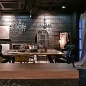
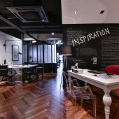
| DESIGN NAME: The Roof PRIMARY FUNCTION: Lifestyle Concept Studio INSPIRATION: Drawing inspiration from the concept of "Opposite Attracts", we focused on the combination of contrasting design elements such as cozy soft furnishing, glamorous decorations and automated smart home system on top of a rustic and unfinished-looking industrial backdrop; the contrast between a dark color palette and natural sunlight further emphasized its soothing ambience. Ultimately, this unconventional technique has illustrated "The Beauty of Imperfection". UNIQUE PROPERTIES / PROJECT DESCRIPTION: Exploring the design concept of "Industrial Glam", this shop lot is essentially divided into two core areas (Design Studio & Showroom), each serving task-specific purposes while personalized through the application of visually-enticing design features. On one hand, the front portion of the shop lot features a stylish, loft-inspired showroom while the back portion is transformed into an open work space with a comfortable atmosphere that stimulates creativity. As such, efforts are focused into harmonizing a wide selection of hugely contrasting design elements to produce a glamorous and highly sophisticated space that draws attention onto unique visual focal points throughout the shop lot. At the same time, metal-framed folding doors were incorporated to provide clear segregation between our showroom and studio space while maintaining the integrity of our lofty design concept. OPERATION / FLOW / INTERACTION: At the main entrance, the shop lot is immediately separated into a showroom on the right and a design studio on the left. On the one hand, the design studio an open working area, enhanced with a white color scheme that encourages interactions and reduces tension. Also fashioned with an open space concept, the showroom is further distinguished into a living area, dining space and a fully-functional kitchen equipped with state-of-the-art appliances. When not in used, the showroom doubles as an extension of the design studio as the dining space can be converted into a meeting area while the kitchen serves as a pantry. The living area naturally becomes a lounging area for the staffs. Not one inch of space is wasted. PROJECT DURATION AND LOCATION: Commenced in March 2015, this project that is situated in a commercial hub within Selangor of Malaysia was completed in January 2016. FITS BEST INTO CATEGORY: Interior Space and Exhibition Design |
PRODUCTION / REALIZATION TECHNOLOGY: In order to illustrate the beauty of imperfection, we were particularly bold with our selections of design elements by integrating raw materials (cement, exposed bricks and natural wood), refined finishing (quartz, marble and glossy surfaces) and glamorous decor (crystal chandelier, leather, fur and mirror fixtures). Apart from aesthetics, we captured the glamorous appeal of our design through functionality by integrating smart home automation features into the shop lot. SPECIFICATIONS / TECHNICAL PROPERTIES: 1800 SQFT TAGS: industrial glam, design studio, open-layout plan, lifestyle concept, Malaysia RESEARCH ABSTRACT: We started our design with a series of intensive researches investigating architectural structure of European buildings. Through these exercises, attempts were made to analyze the selection of building materials, application of natural lighting and interactions with the surrounding environment. Apart from that, we have also studied the science behind colors and their connections with human emotions. As a result of combining the findings from both studies into our design process, the outcome has proven outstandingly impressive in our bid to create a calming ambience within a visually-dynamic space that immediately puts visitors at ease. CHALLENGE: Practicality and cost-efficiency were always a major focus in our design process, especially when it came to space planning where we had to divide the shop lot into a showroom and a design studio while ensuring that each space is illuminated with a healthy amount of natural light to reduce energy consumption. At the same time, low-maintenance structures and durable materials such as natural wood, concrete flooring as well as exposed brick walls were incorporated into the design; a practical choice for a commercial space while maintaining the authenticity of its design concept. ADDED DATE: 2017-03-06 09:29:24 TEAM MEMBERS (2) : Design Director: Ken Thong and Design Manager: Emma Yap IMAGE CREDITS: Gavin |
||||
| Visit the following page to learn more: https://www.theroof.my | |||||
| AWARD DETAILS | |
 |
The Roof Lifestyle Concept Studio by Ken Thong and Emma Yap is Winner in Interior Space and Exhibition Design Category, 2016 - 2017.· Read the interview with designer Ken Thong and Emma Yap for design The Roof here.· Press Members: Login or Register to request an exclusive interview with Ken Thong and Emma Yap. · Click here to register inorder to view the profile and other works by Ken Thong and Emma Yap. |
| SOCIAL |
| + Add to Likes / Favorites | Send to My Email | Comment | Testimonials | View Press-Release | Press Kit | Translations |
| COMMENTS | ||||
|
||||
Did you like Ken Thong and Emma Yap's Interior Design?
You will most likely enjoy other award winning interior design as well.
Click here to view more Award Winning Interior Design.


