UX UI & FED - Batchly Web Application by Lollypop Design Studio

Home > Winners > #56446


DESIGN DETAILS
DESIGN NAME:
UX UI & FED - Batchly

PRIMARY FUNCTION:
Web Application

INSPIRATION:
At Lollypop we are always inspired with everyday life and the strive to outdo ourselves. The power to ease the lives of others in itself is extremely motivating and when you are presented with an opportunity that required visualising huge amounts of numbers and working with business that you have never gotten a chance to, it is even more exciting. The idea to work on a web application and the marketing website was enthralling because we had to understand the whole business module and interact with many users to understand their challenges. Another major inspiration was designing a dashboard and ensuring that we break the clutter and present the meaningful information in fraction of seconds.

UNIQUE PROPERTIES / PROJECT DESCRIPTION:
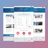
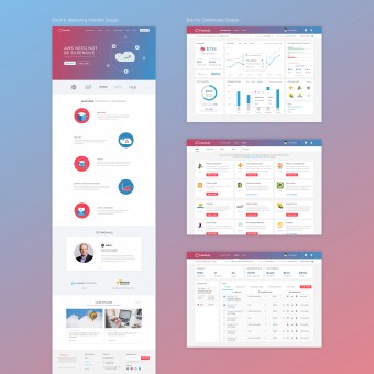
Batchly had three major challenges; the most important was the usability to ensure that the app is easy to use and provides a seamless experience; this was achieved by grouping the various dispersed functionalities together at one place and editing was also enabled from single place itself. Second, was to ensure that administrators on the app could have an extremely visual and intelligent dashboard that was effective and time saving. And, the last one was the communication and positioning of Batchly through its marketing website.

OPERATION / FLOW / INTERACTION:
Batch.ly is a multi-user system and has intelligently grouped the functionalities to enable commands from the control panel itself. All the inputs are majorly prefilled template to ease users in the process. All user editable elements support pristine, error and success state. All actions give feedback to users, provision for validations and message display are in the same page; controls are positionally static at all times including state change or message display.

PROJECT DURATION AND LOCATION:
The Project started in September 2016 in Bangalore and finished in November 2016. We completed the UX, UI and FED for the website and Web app.

FITS BEST INTO CATEGORY:
Interface, Interaction and User Experience Design

PRODUCTION / REALIZATION TECHNOLOGY:
Our UX Team used focused group surveys, questionnaires for the research and Sketch app was used for wireframing. Adobe suite was used by designers. Our developers used js and css for development.

SPECIFICATIONS / TECHNICAL PROPERTIES:
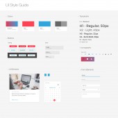
Though overall design in the website and app is flat , we have also introduced gradient design in spaces to communicate its USP and make it vibrant and cheerful.

TAGS:
Flat Design, Gradient, Isometric Illustrations, Big Background Images, Navigation, Responsive

RESEARCH ABSTRACT:
Post several meetings and UX questionnaire with the founders, we began with a focused group discussions for different set of users to understand their need, requirement and gap in the market. We also had user's questionnaires to gauge the suggestions. In hand we were conducting an in-depth competitor analysis to gauge how to craft a unique experience and communicate Batchly's USP of Cost -cutting.

CHALLENGE:
Providing the bird view of the most relevant information in the first fold of the dashboard for a complete understanding at CTO level

ADDED DATE:
2017-03-05 17:52:06

TEAM MEMBERS (3) :
UX Designer: Mishq Laliwala, UI Designer: Shiva Shankar and Illustrator: Preethika Asokan

IMAGE CREDITS:
Lollypop Design Studio, 2016.


CLIENT/STUDIO/BRAND DETAILS
NAME:
Batchly

PROFILE:
Batchly is a global cloud management platform used by AWS customers to run their business-critical web services, batch and big data applications. The business helps AWS users to reduce their cost in a friction less manner. The design inclination of the clients is what differentiates it from many other players in the market. They visualized a user-friendly dashboard which would reduce the time of the admin drastically and would make the task easier for the users. The grouping of multiple functions and the ability to perform tasks from a single dashboard cuts down the tedious work on one hand and on other hand the admin can monitor various tasks and all other required information in the landing page of dashboard itself; it summarizes the savings, no. of tasks, dates and people assigned to it. The design language used is also visually appealing and breaks the monotony of data driven websites; the vibrant colors and icons and illustrations helps Batchly become intuitive and interactive for the users.


NOMINATION DETAILS

Ux Ui & Fed-Batchly Web Application by Lollypop Design Studio is a Nominee in Mobile Technologies, Applications and Software Design Category.

· This project is currently confidential as results have not been announced yet. Images and further details of the project is not available for public yet, please check back later. If you are the owner of this design, please login to view the images.

· Click here to register today inorder to be able to view the profile and other works by Lollypop Design Studio when results are announced.


AWARD DETAILS

Ux Ui & Fed-Batchly Web Application by Lollypop Design Studio is Winner in Mobile Technologies, Applications and Software Design Category, 2016 - 2017.


· Press Members: Login or Register to request an exclusive interview with Lollypop Design Studio.

· Click here to register inorder to view the profile and other works by Lollypop Design Studio.


SOCIAL
+ Add to Likes / Favorites | Send to My Email | Submit Comment | Comment | Testimonials | View Press-Release | Press Kit | Translations


Did you like Lollypop Design Studio's Mobile Design?
You will most likely enjoy other award winning mobile design as well.
Click here to view more Award Winning Mobile Design.


Did you like Ux Ui & Fed-Batchly Web Application? Help us create a global awareness for good mobile design worldwide. Show your support for Lollypop Design Studio, the creator of great mobile design by gifting them a nomination ticket so that we could promote more of their great mobile design works.

See other A' Design Award and Competition WinnersA' Design Award Presentation Submit Your Designs
 
design award logo

BENEFITS
THE DESIGN PRIZE
WINNERS SERVICES
PR CAMPAIGN
PRESS RELEASE
MEDIA CAMPAIGNS
AWARD TROPHY
AWARD CERTIFICATE
AWARD WINNER LOGO
PRIME DESIGN MARK
BUY & SELL DESIGN
DESIGN BUSINESS NETWORK
AWARD SUPPLEMENT

METHODOLOGY
DESIGN AWARD JURY
PRELIMINARY SCORE
VOTING SYSTEM
EVALUATION CRITERIA
METHODOLOGY
BENEFITS FOR WINNERS
PRIVACY POLICY
ELIGIBILITY
FEEDBACK
WINNERS' MANUAL
PROOF OF CREATION
WINNER KIT CONTENTS
FAIR JUDGING
AWARD YEARBOOK
AWARD GALA NIGHT
AWARD EXHIBITION

MAKING AN ENTRY
ENTRY INSTRUCTIONS
REGISTRATION
ALL CATEGORIES

FEES & DATES
FURTHER FEES POLICY
MAKING A PAYMENT
PAYMENT METHODS
DATES & FEES

TRENDS & REPORTS
DESIGN TRENDS
DESIGNER REPORTS
DESIGNER PROFILES
DESIGN INTERVIEWS

ABOUT
THE AWARD
AWARD IN NUMBERS
HOMEPAGE
AWARD WINNING DESIGNS
DESIGNER OF THE YEAR
MUSEUM OF DESIGN
PRIME CLUBS
SITEMAP
RESOURCE

RANKINGS
DESIGNER RANKINGS
WORLD DESIGN RANKINGS
DESIGN CLASSIFICATIONS
POPULAR DESIGNERS

CORPORATE
GET INVOLVED
SPONSOR AN AWARD
BENEFITS FOR SPONSORS
IMPRESSUM IMPRINT

PRESS
DOWNLOADS
PRESS-KITS
PRESS PORTAL
LIST OF WINNERS
PUBLICATIONS
RANKINGS
CALL FOR ENTRIES
RESULTS ANNOUNCEMENT

CONTACT US
CONTACT US
GET SUPPORT

Good design deserves great recognition.
A' Design Award & Competition.