Kosh! Oats by BLOK |
Home > Winners > #56088 |
 |
|
||||
| DESIGN DETAILS | |||||
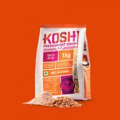
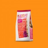
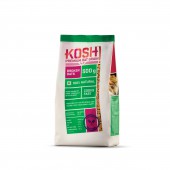
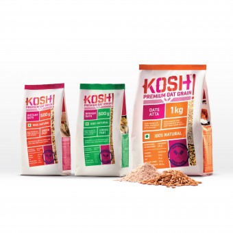
| DESIGN NAME: Kosh! PRIMARY FUNCTION: Oats INSPIRATION: For the package design we drew inspiration from Indian street typography & Indian vintage industrial, wholesale packaging and reimagined it in a contemporary context, to establish a sense of grass-root familiarity & dependability towards an unfamiliar product for the Indian consumer. By referencing industrial labels, seals & wholesale packaging materials, and modernising it we aimed to create a connection to the collective Indian consciousness of local quality & a sense of belonging. UNIQUE PROPERTIES / PROJECT DESCRIPTION: Kosh! is a newly launched Indian oats brand by Future Consumer that aims to establish itself as India's 3rd staple grain after rice & wheat. As oats is relatively unfamiliar in India, we focused on the packaging communicating dependability & transparency, by flipping conventional food packaging formats & bringing helpful nutritional information often lost in the fine print of the back-of-pack to the forefront. OPERATION / FLOW / INTERACTION: Using the diverse product formats from Kosh! such as Oats Atta (flour), Broken Oats, Wheat+Oats Atta (flour) & Instant Oats, consumers can incorporate Kosh! into their everyday meals be it porridges, pancakes and various other lunch & dinner dishes that require grain. The brand encourages the end user to use one's creativity & imagination to experiment with their everyday dishes using the range of oat products. PROJECT DURATION AND LOCATION: The project was based in Mumbai, India and started in January 2016 and was completed in August 2016. FITS BEST INTO CATEGORY: Packaging Design |
PRODUCTION / REALIZATION TECHNOLOGY: For production material, the packaging for the Kosh! range use matte laminated metalized stand up pouches. For 6 colour printing, CMYK + 2 Pantone colours were used for each oats variant. SPECIFICATIONS / TECHNICAL PROPERTIES: 500 g pouches: 120 mm x 57 mm x 280 mm 1 kg pouches: 170 mm x 65 mm x 335 mm TAGS: oats, kosh, packaging, branding, blok, design RESEARCH ABSTRACT: The studio conducted exploratory research for the project. The objective was to gain insight on consumer behaviour in India towards a relatively unfamiliar food grain such as oats. A qualitative methodology was adopted, with data collection through a series of store visits to large retail outlets that contain a wide range of oats brands. This was done to better understand consumer behaviour in India with relation to oats. A critical insight observed was that with rising fitness awareness among consumers, shoppers often focus on ingredient lists and health information at the back of the packaging, rather than on the front label communication. CHALLENGE: Given the low consumption of oats in India and rising fitness awareness, the brand aims to establish itself as India's 3rd staple grain after rice & wheat. The challenge was to develop a brand identity and package design that could spark an instant connect with the Indian consumer for a relatively unfamiliar product and incite excitement to experiment with recipes using oats. ADDED DATE: 2017-02-28 21:45:06 TEAM MEMBERS (2) : Vaishnavi Mahendran and Žarko Dumičić IMAGE CREDITS: Image #1 : Creator KoshOats.com, Kosh!, 2016. Image #2 : Creator KoshOats.com, Kosh!, 2016. Image #3 : Creator KoshOats.com, Kosh!, 2016. Image #4 : Creator KoshOats.com, Kosh!, 2016. |
||||
| Visit the following page to learn more: http://koshoats.com/index.php | |||||
| AWARD DETAILS | |
 |
Kosh! Oats by Blok is Winner in Packaging Design Category, 2016 - 2017.· Read the interview with designer BLOK for design Kosh! here.· Press Members: Login or Register to request an exclusive interview with BLOK. · Click here to register inorder to view the profile and other works by BLOK. |
| SOCIAL |
| + Add to Likes / Favorites | Send to My Email | Comment | Testimonials | View Press-Release | Press Kit |
Did you like Blok's Packaging Design?
You will most likely enjoy other award winning packaging design as well.
Click here to view more Award Winning Packaging Design.


