DESIGN NAME:
LuvIt Rocks
PRIMARY FUNCTION:
Pralines
INSPIRATION:
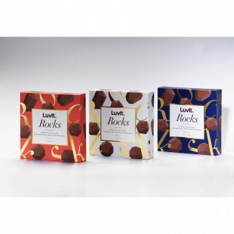
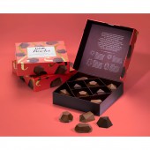
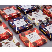
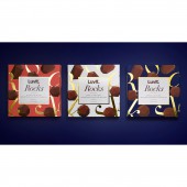
We redesigned the shape of the product, inspired by the geometric shapes of precious gems and branded the range as LuvIt Rocks — a tongue-in-cheek pun implying 'great taste' as well as referring to it's precious stone-inspired shapes or informally termed as 'rocks' in youth-speak. The box design was inspired by jewellery boxes that contain precious stones. We designed an elegant custom typographic brand pattern for the packaging with gold-foiled letters that playfully wrap around the box.
UNIQUE PROPERTIES / PROJECT DESCRIPTION:
LuvIt is a Indian youth-oriented chocolate brand. For their pralines collection, they wished to target young adults, as the existing pralines consumption demographic was middle-aged customers. The challenge was to create something trendy yet sophisticated for young adults. We designed custom praline shapes, branded as LuvIt Rocks — a tongue-in-cheek pun suggesting great taste alongside it's precious gem-inspired shapes. The boxes come in three distinct colors to choose from as preferred.
OPERATION / FLOW / INTERACTION:
In terms of consumer interaction, the praline collection is a ready-to-eat set of chocolates that are available for purchase at major retail stores across India. Consumers experience 4 distinct flavours of pralines i.e coffee, lemon, strawberry & hazelnut. Envisioned as an ideal gift throughout the year when visiting friends, family or dinner parties, customers can pick 1 of the 3 box colour options as per their choice.
PROJECT DURATION AND LOCATION:
The project was undertaken in Mumbai, India, starting from May 2016 and finishing in August 2016.
FITS BEST INTO CATEGORY:
Packaging Design
|
PRODUCTION / REALIZATION TECHNOLOGY:
Gold foil stamping was used for the brand pattern's letters that wrap around the box. Spot UV & emboss was used for the LuvIt logo label area.
SPECIFICATIONS / TECHNICAL PROPERTIES:
167 mm x 30 mm x 167 mm
TAGS:
pralines, praline, chocolate, chocolates, blok, luvit, packaging, design
RESEARCH ABSTRACT:
Exploratory research was undertaken as well as market research from the client was received. The objective was to understand consumer behaviour of new experience-seeking young adults in the praline market. A qualitative methodology was used through alignment meetings with the client, receiving focus group insights on young adults' praline consumption. The findings suggested that pralines are consumed by older, mature buyers. The focus was to balance trendy with elegance in the package design.
CHALLENGE:
For this pralines collection, the brand wished to newly target young adults, as the consumer insight received was that current pralines consumption trends show that the demographic was primarily middle-aged customers. The challenge was to open the market for pralines to young adults, creating packaging that would appeal to the trendy young adult sensibilities while retaining the sophisticated nature of praline chocolates.
ADDED DATE:
2017-02-28 19:42:44
TEAM MEMBERS (2) :
Vaishnavi Mahendran and Žarko Dumičić
IMAGE CREDITS:
Image #1: Photographer Qench, LuvIt Rocks, 2017.
Image #2: Photographer Qench, LuvIt Rocks, 2017.
Image #3: Photographer Qench, LuvIt Rocks, 2017.
Image #4: Photographer Qench, LuvIt Rocks, 2017.
|
