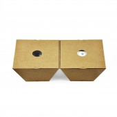
A BOWL OF RICE Gift by Tengxian Zou |
Home > Winners > #55846 |
 |
|
||||
| DESIGN DETAILS | |||||
| DESIGN NAME: A BOWL OF RICE PRIMARY FUNCTION: Gift INSPIRATION: The package design of organic rice and the bowl for a brand which focus on farm products.This concept takes design inspiration from traditional Chinese Rice Container in countryside. My first thought was to get a different structure and appearance. UNIQUE PROPERTIES / PROJECT DESCRIPTION: With the common material,the lowest cost and integrated structure to interpret the traditional concept, so that "food" and "Container" OPERATION / FLOW / INTERACTION: This is the structure of a piece of paper to complete, no other special material, so which can greatly save space in the warehouse store. At the same time ,this box can also use a few simple steps to complete the package, when using a lot of boxed to display through the different way,it would be cool. PROJECT DURATION AND LOCATION: Jan-2016,Shanghai,PR.China FITS BEST INTO CATEGORY: Packaging Design |
PRODUCTION / REALIZATION TECHNOLOGY: Due to the common packing material, so the production will be very easy to make. Only need to cardboard mold developed for mass production. SPECIFICATIONS / TECHNICAL PROPERTIES: Material: 0.8 mm thickness of the paper size: 16 cm (W), 16 cm (D), 20.5 cm (H) TAGS: - RESEARCH ABSTRACT: Company prepare some gifts for our friends and customers in each year. This project is working with an agricultural brand ,for customers' demand ,we would like to make this a gift more interesting through the rice. From product's name even the bowl inside, the purpose is to let people feel the "person" and "food" and "objects" is the most simple and clean relationship in this package. We did redesign the rice container's structure by innovation, as far as possible reduce the visual design in printing on the package at the same time, so that urbanite could feel the most real emotional communication. We believe that using the most simple ideas and natural materials to complete such a package can get a perfect answer in the modern life. CHALLENGE: Because it is in the structure of a piece of paper to complete, and we also want to consider the way to open rationale and on the functional design for protection of products inside, prophase I tried many ways, it is a big challenge. Finally on the trapezoid Angle adjustment took a long time, each side in order to make it look is perfect. ADDED DATE: 2017-02-28 15:57:11 TEAM MEMBERS (1) : Tengxian Zou IMAGE CREDITS: Shanghai Version Design |
||||
| Visit the following page to learn more: http://version-sh.cn/?portfolio=lonshare | |||||
| AWARD DETAILS | |
 |
A Bowl of Rice Gift by Tengxian Zou is Winner in Packaging Design Category, 2016 - 2017.· Read the interview with designer Tengxian Zou for design A BOWL OF RICE here.· Press Members: Login or Register to request an exclusive interview with Tengxian Zou. · Click here to register inorder to view the profile and other works by Tengxian Zou. |
| SOCIAL |
| + Add to Likes / Favorites | Send to My Email | Comment | Testimonials | View Press-Release | Press Kit |
Did you like Tengxian Zou's Packaging Design?
You will most likely enjoy other award winning packaging design as well.
Click here to view more Award Winning Packaging Design.


