A Space Temporary Showroom by Plajer & Franz Studio |
Home > Winners > #55194 |
 |
|
||||
| DESIGN DETAILS | |||||
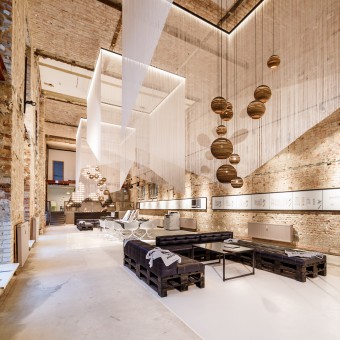
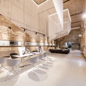
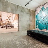
| DESIGN NAME: A Space PRIMARY FUNCTION: Temporary Showroom INSPIRATION: the client required a low-budget showroom in a previous industrial building in berlin mitte that had been turned into an apartment building. the idea was to combine the industrial charm with homely materials for a distinctive character trait. the sophisticated atmosphere of the space created by exposed brick and wood including traces of repair works from the last decades contrasted by a premium-quality modern furnishings surprised and excited clients and passersby for the time being. UNIQUE PROPERTIES / PROJECT DESCRIPTION: 'A space' was located in berlin mitte as a temporary showroom for building company NATULIS group AG, offering a great platform to show and sell a range of apartments being built at this location. the design of the showroom is marked by a mix between rough, edgy and refined, elegant elements. this symbiosis turned the space into an eye-catcher while offering great opportunities for counseling and sales conversations. OPERATION / FLOW / INTERACTION: the showroom serves the presentation and sale of lofts in an former industrial building that has been transformed into an apartment building. the design had to correspond this functional purposes and offer spacious presentation opportunities as well as lounge areas for client communication. a city map of the area greets the customers at the entrance while a model of the building and floor plans on the walls were giving a visual idea of the apartments for sale. situated at the end of the spacious open space was a small bar for drinks and snacks accompanying consultation. PROJECT DURATION AND LOCATION: temporary showroom in Berlin, 2015 FITS BEST INTO CATEGORY: Interior Space and Exhibition Design |
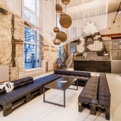
PRODUCTION / REALIZATION TECHNOLOGY: a fascinating symbiosis between industrial attributes and high-quality materials is responsible for the distinctive character trait. to achieve this the original space has been gutted, the inserted ceiling removed and a room with almost 8 meters ceiling height - corresponding the original state as a theatre screen - created. the wal ls have been left in its‘ primar, brick-lined condition showing the exposed brick wood including traces of repair works from the last decades. seating furniture are made of dark oiled standard industrial palettes, yet covered with a premium-quality upholstery. all tables (loungetable, exposétable, model-tabel) are made of black steel; the bar at the end of aleppo pine. noble, up to five meters long thread curtains hang above the counseling islands and serve as partitions structuring the space. a light bulb installation in the shape of an „A“ reminds us of illuminated advertising known from cinemas of the 20s and in thus reveals the original function of the space. SPECIFICATIONS / TECHNICAL PROPERTIES: 400 sqm / ca. 300 sqm floor space TAGS: showroom, retail design, interior design RESEARCH ABSTRACT: - CHALLENGE: „A space“came into being within a very short period and on low-budget. Nevertheless, the special atmosphere of the raw style of the space combined with modern furnishing created a special and homely atmosphere that surprised and excited clients and passersby. ADDED DATE: 2017-02-26 13:48:52 TEAM MEMBERS (1) : project manager: sophie gatzke IMAGE CREDITS: christian rudat, photography |
||||
| Visit the following page to learn more: http://plajer-franz.de/en/projects/a-spa |
|||||
| AWARD DETAILS | |
 |
A Space Temporary Showroom by Plajer & Franz Studio is Winner in Interior Space and Exhibition Design Category, 2016 - 2017.· Read the interview with designer Plajer & Franz Studio for design A Space here.· Press Members: Login or Register to request an exclusive interview with Plajer & Franz Studio. · Click here to register inorder to view the profile and other works by Plajer & Franz Studio. |
| SOCIAL |
| + Add to Likes / Favorites | Send to My Email | Comment | Testimonials | View Press-Release | Press Kit |
Did you like Plajer & Franz Studio's Interior Design?
You will most likely enjoy other award winning interior design as well.
Click here to view more Award Winning Interior Design.


