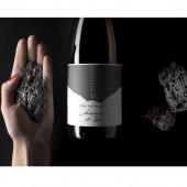
Nero di Sei / Bianco di Sei Wine Label by Mario Di Paolo |
Home > Winners > #55158 |
 |
|
||||
| DESIGN DETAILS | |||||
| DESIGN NAME: Nero di Sei / Bianco di Sei PRIMARY FUNCTION: Wine Label INSPIRATION: The Palmento Costanzo winery is based in Mount Etna in Sicily. For this project with the vineyard we have taken their unique concept of quality and terroir and translated it into unique piece of branding. UNIQUE PROPERTIES / PROJECT DESCRIPTION: After an intense period of research, we produced a wine-bottle label printed with an extract of volcanic dust from Mount Etna.The result is extraordinary; a tactile, luminescent and visually stimulating label that connects the consumer with the very essence of the wine.By running your fingers across the elevated label, you release volcanic dust, the very smell of Etna. We have used the natural colours of the magma to evoke a sense of place in one label capturing the fine organic wines. OPERATION / FLOW / INTERACTION: Actually the brand is not well known, the old labels did not represent this project.In our project, we decided to innovate, putting volcanic dust directly on the label. This is the challenge of this project.The target audience is a very selected wine lovers all over the world. Starting from the old label, our project add value to the brand transforming the perception of the consumer. The new conception of packaging increasing charm and becomes an sensorial experience for the consumer. As result, after six months, sales and the bottle price are growing up in a significant way. PROJECT DURATION AND LOCATION: The project started in January 2016 in Catania and ended in the month of December 2016 Spoltore, it is an unpublished work. FITS BEST INTO CATEGORY: Packaging Design |
PRODUCTION / REALIZATION TECHNOLOGY: For this project with the vineyard we have taken their unique concept of quality and terroir and translated it into unique piece of branding. After an intense period of research, we produced a wine-bottle label printed with an extract of volcanic dust from Mount Etna. The result is extraordinary, tactile, luminescent and visually stimulating label that connects the consumer with the real essence of the wine.By running your fingers across the elevated label, you release volcanic dust, the very smell of Etna.We have used the natural colours of the magma to evoke a sense of place - in one label capturing the fine organic wines made from the ancient grapes of Nerello Mascalese, Nerello Cappuccio, Carricante and Cataratto. SPECIFICATIONS / TECHNICAL PROPERTIES: The volcanic shape on the label is realized in shining volcanic dust: the real essence of territory directly on the label. We selected, directly on field, volcanic stones to be pulverize to obtain very thin powder to use like printing material. Trough our printing technology engineer we create a new pigment, never used before, to use in typography silk-screen printing. TAGS: packaging, wine, label, innovation, RESEARCH ABSTRACT: Mario Di Paolo, a designer and photographer, is founder and CEO of the communication and marketing company Spazio Di Paolo, which specialises in food and beverage. He has received many awards at prestigious design competitions from across the world for his marketing strategies and for the originality of his packaging designs. CHALLENGE: The project designed to Palmento Costanzo is unique in the world, it was a challenge to create a printable pigment with sophisticated printing presses. It is innovative and involves smell, touch and view. ADDED DATE: 2017-02-26 11:02:17 TEAM MEMBERS (1) : IMAGE CREDITS: Creator Mario Di Paolo |
||||
| Visit the following page to learn more: http://www.spaziodipaolo.it/packaging-co |
|||||
| AWARD DETAILS | |
 |
Nero Di Sei/Bianco Di Sei Wine Label by Mario Di Paolo is Winner in Packaging Design Category, 2016 - 2017.· Read the interview with designer Mario Di Paolo for design Nero di Sei / Bianco di Sei here.· Press Members: Login or Register to request an exclusive interview with Mario Di Paolo. · Click here to register inorder to view the profile and other works by Mario Di Paolo. |
| SOCIAL |
| + Add to Likes / Favorites | Send to My Email | Comment | Testimonials | View Press-Release | Press Kit |
Did you like Mario Di Paolo's Packaging Design?
You will most likely enjoy other award winning packaging design as well.
Click here to view more Award Winning Packaging Design.


