Project 155 Private Appartment by Penka Stantcheva |
Home > Winners > #55025 |
 |
|
||||
| DESIGN DETAILS | |||||
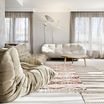
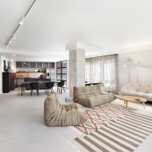
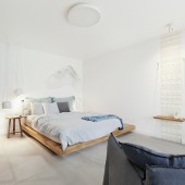
| DESIGN NAME: Project 155 PRIMARY FUNCTION: Private Appartment INSPIRATION: This project views the home as a private place to relax. We take pride in the main result - the peaceful mood that comes upon anyone, entering the apartment. We created a spacious place yet not empty, monochromatic yet neither raw nor boring. The design is inspired by the industrial vintage style with a more sophisticated touch in the details. The grey surfaces of the floor and white walls are complimented by natural wood, linen, Bulgarian ethno details in the textiles and indistinct faded colors. UNIQUE PROPERTIES / PROJECT DESCRIPTION: A 200 m2 private residence on the ground floor in front of a park with a perfect view of the Vitosha mountain. Three zones were created - one continuous space for living, dining and cooking with a corridor converted into a library, another one around the owners’ bedroom and the third dedicated to guests. The main purpose of the design was to keep the visual spaciousness of the new zones but also to ensure that the rooms would not appear "unfurnished&qu OPERATION / FLOW / INTERACTION: Being architects, we usually introduce our clients into the matters of design and spatial interactions. However in the case of Project 155 there was mutual exchange of concepts, and it was the client who demonstrated to us what a habitable restrain might look like. The end result that we achieved together was one that fitted him well. PROJECT DURATION AND LOCATION: The project started in Sofia, Bulgaria in November 2015 and finished in December 2016. FITS BEST INTO CATEGORY: Interior Space and Exhibition Design |
PRODUCTION / REALIZATION TECHNOLOGY: The specific look of this project is due first to the floor covering. To achieve the final concrete look we used a cement-based self-leveling layer from 3mm to 5mm, produced by Harmony Beton. The final effect of a waxed concrete is uniform for all the house except the bathrooms, where we inverse the design by using the same material on the walls and exposing the floor through a decorative cement tiles by Bisazza and ceramic tiles by Refin. All the cabinets and the kitchen are designed specially for the house and realized by a local producer. The kitchen seems to look like a pile of cabinets and appliances. But at a more thorough glance one can discover that there is controlled use on this particular sum of elements and they are calmed down in a specific order. The use of 14theen different materials is strictly under control. The concrete table Boiacca from Kristalia is a logical continuation of the kitchen. The sofas, produced by Ligne Roset, are combined with carpets from the local tradition of regions of Chiprovtsi and Rodopi mountain. The lights are chosen attentively from the collections of Flos, Nemo, Foscarini Diesel, Marset, Dekko and Petites Fritures. SPECIFICATIONS / TECHNICAL PROPERTIES: - TAGS: minimal, peaceful, cosy, industrial, vintage, sophisticated, natural, ethno RESEARCH ABSTRACT: - CHALLENGE: The challenge in the design was to fine in the best way the balance between emptiness and density, between minimal and decorative. The second challenge as usual was the realization of the project. Due to the trust and support of the owners we came to this successful result. ADDED DATE: 2017-02-25 16:29:17 TEAM MEMBERS (1) : Technical design: Keti Jivkichova, 3D modeling: Paulina Dimova IMAGE CREDITS: Photographer: Ventzislava Vasileva |
||||
| Visit the following page to learn more: http://www.ps-architects.com/bg/portfoli |
|||||
| AWARD DETAILS | |
 |
Project 155 Private Appartment by Penka Stantcheva is Winner in Interior Space and Exhibition Design Category, 2016 - 2017.· Read the interview with designer Penka Stantcheva for design Project 155 here.· Press Members: Login or Register to request an exclusive interview with Penka Stantcheva . · Click here to register inorder to view the profile and other works by Penka Stantcheva . |
| SOCIAL |
| + Add to Likes / Favorites | Send to My Email | Comment | Testimonials | View Press-Release | Press Kit |
Did you like Penka Stantcheva's Interior Design?
You will most likely enjoy other award winning interior design as well.
Click here to view more Award Winning Interior Design.


