Nuts Snack Series Packages by Yang Jung Eun - Gaenyeom Gongam Studio |
Home > Winners > #54986 |
 |
|
||||
| DESIGN DETAILS | |||||
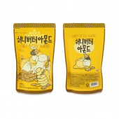
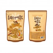
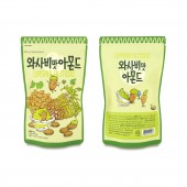
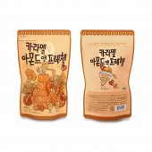
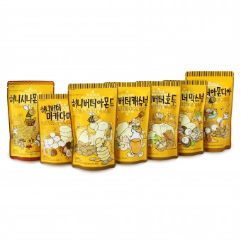
| DESIGN NAME: Nuts Snack Series PRIMARY FUNCTION: Packages INSPIRATION: I usually do graphic design and illustration work. I draw the illustrations in pen, this product was working in that style. The goal of the illustration work was to make it easy for consumers to understand, to have fun, and to communicate product information. I created a character with nuts and drew an interesting situation differently for each products. So, the cartoon, book and animation that I enjoy the usual helped to the work. Expressions and humor from the animations became inspiration. UNIQUE PROPERTIES / PROJECT DESCRIPTION: The Nuts Snack Series packages are designed by using graphic illustration in order to provide customers an idea about the taste of the products to help their purchase. As developing the image characterized by ingredients, the customer will be clearly guided to product information. The purpose of these illustration packages is to provide the product information to help the customer to easily choose their preference and enjoy the products through the motto,“fun and healthy”nuts. OPERATION / FLOW / INTERACTION: After the design of the Nuts Snack Series packages are completed, the products are produced. The Nuts Snack produced are sold in marts, small markets and online malls in all parts of South Korea. The Nuts Snack products of various flavors are unified in one part of the store, so you can see that it is a series product. And it is one of the most popular tourist products to visit when you come to South Korea. Recently, It has been exporting to China, Southeast Asia, USA and so on. PROJECT DURATION AND LOCATION: The project started in December 2014 in South Korea and new products are still being developed continuously. FITS BEST INTO CATEGORY: Packaging Design |
PRODUCTION / REALIZATION TECHNOLOGY: The Nuts Snack Series packages are illustration-driven design. I drew the nuts and the ingredients into the product directly as an illustration. I made the nuts characterized and composed a fun composition with the material image. The illustration was drawn with a pen on paper. And I scanned it, digitized it and finished it with Photoshop and Illustrator program. I did a graphic work on the computer that matched the illustration. Lettering of the title was also done. Using a unified layout, we can see that it is a series product. SPECIFICATIONS / TECHNICAL PROPERTIES: 140 x 60 x 230 mm each / vinyl pouch with lock TAGS: package, design, illustration, character, nuts RESEARCH ABSTRACT: In Korea, there are very few snack packages designed only for illustrations. The Nut Snack Series was the first design in the nuts product to be tried with illustrations only. I was also worried about how the consumer would react. But when we designed and launched the packages, the consumer response was very good. It has quickly become one of the most popular products in Korea. The client has made a huge income, and the product of this illustration has become the identity of the company. There are many products that mimic this design after launch. CHALLENGE: I was worried about completing the package design with illustrations without photograph. It was important not only for pretty illustrations, but also for the consumer to know the information of the product. It should not be difficult, it has to be simple and individual. I wanted to make it easy for the consumer to understand, but not to attract. I concentrated on maintaining that level. And at the same time, I tried to make each product look like a series while showing its individuality. ADDED DATE: 2017-02-25 13:43:39 TEAM MEMBERS (1) : IMAGE CREDITS: Yang Jung Eun - Gaenyeom Gongam Studio, 2016. |
||||
| Visit the following page to learn more: http://www.orison-yang.com | |||||
| AWARD DETAILS | |
 |
Nuts Snack Series Packages by Yang Jung Eun-Gaenyeom Gongam Studio is Winner in Packaging Design Category, 2016 - 2017.· Read the interview with designer Yang Jung Eun - Gaenyeom Gongam Studio for design Nuts Snack Series here.· Press Members: Login or Register to request an exclusive interview with Yang Jung Eun - Gaenyeom Gongam Studio. · Click here to register inorder to view the profile and other works by Yang Jung Eun - Gaenyeom Gongam Studio. |
| SOCIAL |
| + Add to Likes / Favorites | Send to My Email | Comment | Testimonials | View Press-Release | Press Kit |
Did you like Yang Jung Eun-Gaenyeom Gongam Studio's Packaging Design?
You will most likely enjoy other award winning packaging design as well.
Click here to view more Award Winning Packaging Design.


