DESIGN NAME:
Journey Art
PRIMARY FUNCTION:
Interior Space Exhibition Design
INSPIRATION:
Oriental aesthetics is introduced by the shape of the mountain
A mind pursues nature. The integrity of nature and art makes a mind
enjoy a journey by strolling in the merchandising chamber full of art and nature.
UNIQUE PROPERTIES / PROJECT DESCRIPTION:
"Travelling along the edge of a creek, and forgot the distances of
the journey; suddenly he found a forest of peach blossom, and
stayed on the shore he walked a hundred steps; there were no
other trees and the fragrant grasses were fresh and beautiful, the
falling leaves were colourful…" As the beautiful scene written by
Tao Yuanming, in which the mind desires nature, we attempt to
condense nature in the temporary dimension of sales, and by the
sway of minimalism, we transfer business actions into a journey of
the mind and art, ever so coincidentally.
Quality/Texture
The theme is nature. Overall appearance utilizes the original
quality of natural materials. More than one type of pitched stones
form the shape of a mountain and intercalated upon each other
and set the boundary of the body, further juxtaposed with native
Taiwanese trees such as camphor or juniper, and contemporary
artworks such as ash glazed ceramics. The main focus and the
background harmonized in nature.
Circuitous Trail/Hidden
Utilizing the visual transition often found in oriental garden trails
and the design of changing scenery with pace, we cleverly
installed the display of contemporary art. Every slow pace is an
enjoyment in the artistic and elegant dimension. The hidden
modesty is a small boat for the mind to rest.
Element/Boundary
The interior is built by elements of oriental grilles and window
frames. They set the boundary of each reception area granting
them isolation and privacy. And by combining solid and
emptiness, the real boundary becomes indistinguishable for
re-shaping the openness and flow of the supposedly isolated
reception area.
OPERATION / FLOW / INTERACTION:
Taiwan’s reception centers are old-school, so we aims at alteration and innovation. The art and nature motifs upgrade the guests’ state of mind and advance the value added of apartments.
PROJECT DURATION AND LOCATION:
2014-2015 taiwan
FITS BEST INTO CATEGORY:
Interior Space and Exhibition Design
|
PRODUCTION / REALIZATION TECHNOLOGY:
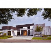
The motifs are nature and oriental aesthetics. The exterior design mixes
light and dark materials with chiseled slates besides rectangular
overlapping of masses extended multi-angularly. A light well making light
and shadow talk manages the low-key modest modern oriental manor
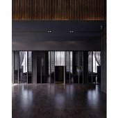
atmosphere. The interior design secures each booth separated and
private by the oriental grids and lattices. Virtual real blurring the interior
and exterior matters reshapes the chamber with open and flowing closed
masses and manages the mood full of art and nature.
As for innovation, the perfect match of the main and foil is managed by
using Taiwan’s endemic trees of camphor, cypress and beech in
combination with artworks of contemporary ceramics, calligraphy and
paintings. The visual transition uses secluded paths and winding alleys in
oriental gardening. The scenery variation in terms of the visitors’ steps
with the contemporary artworks at the end makes each visitor enjoy the
fine modern art and feel mind purification by strolling.
SPECIFICATIONS / TECHNICAL PROPERTIES:
1007m²
TAGS:
滿林昌
RESEARCH ABSTRACT:
Taiwan’s reception centers focus on promoting apartments rather than true residing and living needs, so the designer valuing art and culture includes the both in a multifunctional display chamber full of art and culture with artworks, combining architecture, life and art perfectly and making each visitor know well how the apartments are without overemphasis on merchandising.
CHALLENGE:
1. The main lamp with the Taiwan cypress plaque makes the ceiling reflect solar corona in illumination with fresh cypress smell.
2. The outdoor green corridor with granite and white marble rubbles on it brings the natural sound of rubbles to the visitors in walking.
3. The grids combined with Chinese lattices and sheer in the box zone manage a calm mood with crisscross light and shadow.
4. The right and left sides in front of the architecture decorated with burl as the dry and a pool as the wet symbolizing mountain and river manage a natural atmosphere as the gate opens.
ADDED DATE:
2017-02-25 07:42:56
TEAM MEMBERS (2) :
LIN CHANG.MAN and YI PING.LIN
IMAGE CREDITS:
LIN CHANG MAN, 2016.
|


