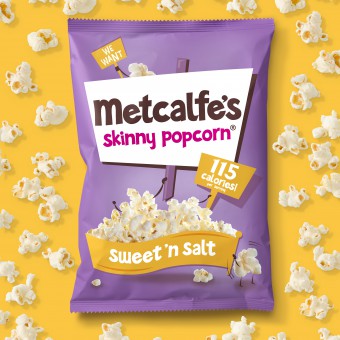
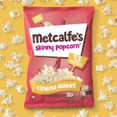
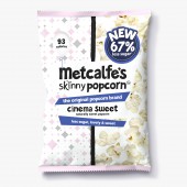
Metcalfe's Skinny Popcorn Food packaging by Springetts Brand Design |
Home > Winners > #54829 |
 |
|
||||
| DESIGN DETAILS | |||||
| DESIGN NAME: Metcalfe's Skinny Popcorn PRIMARY FUNCTION: Food packaging INSPIRATION: We had to communicate that the products were the healthiest in the snacking category in a light hearted and engaging way. Following extensive product development, the packaging needed to be re-evaluated to reflect the brand's proposition of the tastiest, healthiest popcorn which is a guilt-free treat for everyone (and not a limited market, niche product). UNIQUE PROPERTIES / PROJECT DESCRIPTION: We created a range of packs that feature a striking and distinctive design that reflects the brand's engaging, vibrant and light hearted personality. Bold colour combinations for each flavour variant create strong standout on shelf. The popcorn 'dudes' each add personality and communicate the flavour of each SKU in the range. The 'placard' logo and lock-up is an evolution of the existing logo, which takes a generic shape and creates a distinctive and ownable equity for the brand. It reflects the brand's passion for creating the tastiest, healthiest popcorn and making it accessible to all consumers. OPERATION / FLOW / INTERACTION: - PROJECT DURATION AND LOCATION: Project was completed in London in 2016 FITS BEST INTO CATEGORY: Packaging Design |
PRODUCTION / REALIZATION TECHNOLOGY: Snack packaging SPECIFICATIONS / TECHNICAL PROPERTIES: Multipack (6 x 11g), multipack (6 x 17g), 70g, 75g, 80g TAGS: Metcalfe's Skinny Popcorn, Metcalfe's, skinny, popcorn, Springetts, Springetts Brand Design, packaging, branding, rebrand RESEARCH ABSTRACT: Metcalfe's Skinny Popcorn was initally launched by Julian Metcalfe. and through constant innovation it has gained a strong market position within a category which is strong growth. Sugar consumption has become a key health concern in recent years, especially in the snacking category. Metcalfe's have addressed this in an innovative way by developing a unique Stevia blend for sweetening, giving them a clear point of difference over the competition. CHALLENGE: Our task was to communicate that the products were the healthiest in the category full of competing products in a light hearted, engaging way. The brand had invested in extensive product development, so the packaging had to accurately reflect the brand's personality and clearly communicate the proposition of the tastiest, healthiest popcorn that is a guilt-free treat for everyone. ADDED DATE: 2017-02-24 16:46:38 TEAM MEMBERS (1) : IMAGE CREDITS: Springetts Brand Design, 2016. |
||||
| Visit the following page to learn more: http://www.springetts.co.uk/our-work/met |
|||||
| AWARD DETAILS | |
 |
Metcalfe's Skinny Popcorn Food Packaging by Springetts Brand Design is Winner in Packaging Design Category, 2016 - 2017.· Read the interview with designer Springetts Brand Design for design Metcalfe's Skinny Popcorn here.· Press Members: Login or Register to request an exclusive interview with Springetts Brand Design. · Click here to register inorder to view the profile and other works by Springetts Brand Design. |
| SOCIAL |
| + Add to Likes / Favorites | Send to My Email | Comment | Testimonials | View Press-Release | Press Kit |
Did you like Springetts Brand Design's Packaging Design?
You will most likely enjoy other award winning packaging design as well.
Click here to view more Award Winning Packaging Design.


