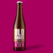
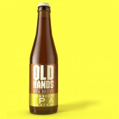
Old Hands Beer packaging by Springetts Brand Design |
Home > Winners > #54758 |
 |
|
||||
| DESIGN DETAILS | |||||
| DESIGN NAME: Old Hands PRIMARY FUNCTION: Beer packaging INSPIRATION: The team spent a lot of time at the Twickenham brewery getting to understand the process of creating craft beers. What impressed them most was the skill and knowledge of the brewers at TFA – they were not fresh out of the city accountants following a dream to launch a beer, they were older, wiser, with a real passion for the craft of what makes a great beer. They had the certificates to prove it. The creative idea came from the clear obvious advantage that ‘it takes old hands to make new brews'. UNIQUE PROPERTIES / PROJECT DESCRIPTION: The use of copper came from the barrel the brewers sit around in the brewery talking about hops and flavours. A raised varnish of a rough handprint was printed onto the copper so each bottle felt like you were shaking hands with the old brewer himself. The copper colour was a link to the tradition and craft of beer making. The second vibrant colour palette was created to illustrate the exciting new flavours and combinations in the range. The final design had modernity, craft, confidence and standout. OPERATION / FLOW / INTERACTION: The bold colours and the unusual flavour combinations encourage younger consumers to try the new range. PROJECT DURATION AND LOCATION: The project was started and completed in 2016, in London. FITS BEST INTO CATEGORY: Packaging Design |
PRODUCTION / REALIZATION TECHNOLOGY: Glass bottles SPECIFICATIONS / TECHNICAL PROPERTIES: 300ml brown glass bottles TAGS: Beer, craft, brand, ales, Twickenham Fine Ales, Springetts, old hands, new brews RESEARCH ABSTRACT: - CHALLENGE: The challenge was for the brand to open up a whole new market for TFA. As a result they are already seeing a far younger audience engaging with them than ever before and already opening up new distribution channels they could not engage with before with their existing ale range. ADDED DATE: 2017-02-24 12:26:13 TEAM MEMBERS (1) : IMAGE CREDITS: Springetts Brand Design, 2016. |
||||
| Visit the following page to learn more: http://www.springetts.co.uk/our-work/old |
|||||
| AWARD DETAILS | |
 |
Old Hands Beer Packaging by Springetts Brand Design is Winner in Packaging Design Category, 2016 - 2017.· Read the interview with designer Springetts Brand Design for design Old Hands here.· Press Members: Login or Register to request an exclusive interview with Springetts Brand Design. · Click here to register inorder to view the profile and other works by Springetts Brand Design. |
| SOCIAL |
| + Add to Likes / Favorites | Send to My Email | Comment | Testimonials | View Press-Release | Press Kit |
Did you like Springetts Brand Design's Packaging Design?
You will most likely enjoy other award winning packaging design as well.
Click here to view more Award Winning Packaging Design.


