Mac Station Store by Odyssey Babasadeghian |
Home > Winners > #54607 |
 |
|
||||
| DESIGN DETAILS | |||||
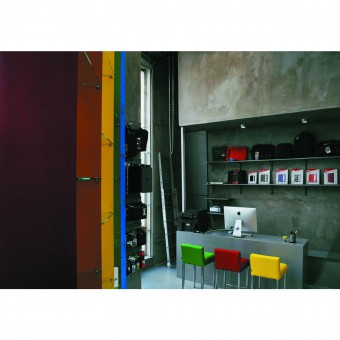
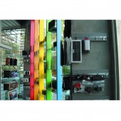
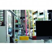
| DESIGN NAME: Mac Station PRIMARY FUNCTION: Store INSPIRATION: It was a small good looking store with an attractive function, had a big challenge with lack of space, time and also budget. It had to be different and also representative for store's specific brand. UNIQUE PROPERTIES / PROJECT DESCRIPTION: It is a design with concept of simplicity. Expose cement covered the walls and 5 famous colors of products has used in furniture in a way that wile minimizing the costs and time also provide a minimal-modern interior that is in harmony with concept of store function. OPERATION / FLOW / INTERACTION: by using fine cement for covering the all of interior surfaces, 3 basic matters of design (lack of time, financial shortage, and concept of simplicity) solved. the forth problem, means; lack of space, solved by using height of store for building a small balcony and also designing all benches and counters with internal useful spaces for storage. PROJECT DURATION AND LOCATION: The project started in Jan 2017 and finished in Feb 2017 in Tehran, Iran. FITS BEST INTO CATEGORY: Interior Space and Exhibition Design |
PRODUCTION / REALIZATION TECHNOLOGY: Expose cement covered all interior surfaces in traditional way of construction and it made a isolation layer for interior space because of it's mastic mode and also minimized the time and cost of construction, Considerably SPECIFICATIONS / TECHNICAL PROPERTIES: 23 square meters store with 4.5 meters height that has 3 large windows in 3 sides. TAGS: Interior design, architecture, interior architecture, persian interior, iranian interior, iranian architecture RESEARCH ABSTRACT: it was a store for sailing and fixing electronic devices. So designer started to do field studies in the previous stores and designing the questionnaire and interviewing with costomers to find a clues for design. During the first analyzes she noticed that almost all costomers came to This type of stores want to have a consultation before they buy somthing or give their devices to fix. then they want to see enough samples to choose and they want to get this consultation in a comfortable place. On the other hand there were store's staffs. Their point of view was more practical and economical. most of them prefer to work in a modern, practical space. Lightings was one of the most important mater for them. And also the repairing area. So designer had to answer these main needs of design's contacts. CHALLENGE: The hardest part of this design was about, financial shortage, lack of time and providing enough space for staffs and products that was going to be sales in this small space. ADDED DATE: 2017-02-23 18:28:42 TEAM MEMBERS (1) : Odyssey Babasadeghian IMAGE CREDITS: Odyssey babasadeghian |
||||
| Visit the following page to learn more: https://Www.shavmad.com | |||||
| AWARD DETAILS | |
 |
Mac Station Store by Odyssey Babasadeghian is Winner in Interior Space and Exhibition Design Category, 2016 - 2017.· Read the interview with designer Odyssey Babasadeghian for design Mac Station here.· Press Members: Login or Register to request an exclusive interview with Odyssey Babasadeghian. · Click here to register inorder to view the profile and other works by Odyssey Babasadeghian. |
| SOCIAL |
| + Add to Likes / Favorites | Send to My Email | Comment | Testimonials | View Press-Release | Press Kit |
Did you like Odyssey Babasadeghian's Interior Design?
You will most likely enjoy other award winning interior design as well.
Click here to view more Award Winning Interior Design.


