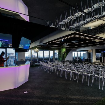
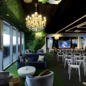
The Gallery Glaces Multifunctional working interior by Yu Ting Wang and Chien Hsing Chen |
Home > Winners > #54510 |
 |
|
||||
| DESIGN DETAILS | |||||
| DESIGN NAME: The Gallery Glaces PRIMARY FUNCTION: Multifunctional working interior INSPIRATION: The space was surrounded by glasses on both sides, the first we thought we wanted to design a modern Glerie Des Glaces and we wanted to adapt the surrounding and the space's reflection into the open area. We want people entering the space not only just seeing the design but also can see the reflection from different angles to see things in many different ways, just like we wanted the space is not only for a purpose. UNIQUE PROPERTIES / PROJECT DESCRIPTION: As we worked with the firm for the past few project, we continued with the sports and sustainable design but adding in new ideas as the cloud and passage of old and new generation. With limited budget, we achieved designed a working space is not only a usage of working, but also a place for people sharing ideas and thoughts, and make the maximum use of its function and a space that can speak for its self. OPERATION / FLOW / INTERACTION: The clients is very thought for for the environment as they are working in the fabric business. This project is also joining the LEED scoring, therefore from the start making decision for materials we have to think through carefully. As our main concern is to use less amount of construction materials and make the most usage of them, just like our main design brief, to be multi-functional and the Gallery Glaces to see materials in different ways, we used mirrors as the main material in the site. It has different view when we look at it at different angles, and it reflects different materials on it, to make the site more interesting and using less materials. PROJECT DURATION AND LOCATION: The project started in October 2016 and finished in January 2017 in Taichung Taiwan. FITS BEST INTO CATEGORY: Interior Space and Exhibition Design |
PRODUCTION / REALIZATION TECHNOLOGY: As we see the site, we separated the areas by abstract lines. Using abstract like we separated the materials, such as carpet, artificial grass, wooden floor to separated the main use of each area. On walls, due to its a concept of Gallery Glaces, we used mainly grey and black mirrors to add on reflections and enhance to enlarge the site. The hanging mirrors are made by stainless steel frame and glass to make it look like floating glasses hanging from ceiling. SPECIFICATIONS / TECHNICAL PROPERTIES: - TAGS: Office, multifunctional, exhibition, concert hall, RESEARCH ABSTRACT: - CHALLENGE: The hardest part of this project is how to make the space multi-functional, the budget and also the time limits. Making the space multi-functional and also to store the mobile furniture at the particular space is also a great concern for the design. ADDED DATE: 2017-02-23 09:32:28 TEAM MEMBERS (1) : Yu-Ting Wang, Chien-Hsing Chen IMAGE CREDITS: Potographer Kensaku Lai |
||||
| Visit the following page to learn more: http://rkdesign.com.tw/ | |||||
| AWARD DETAILS | |
 |
The Gallery Glaces Multifunctional Working Interior by Yu Ting Wang and Chien Hsing Chen is Winner in Interior Space and Exhibition Design Category, 2016 - 2017.· Read the interview with designer Yu Ting Wang and Chien Hsing Chen for design The Gallery Glaces here.· Press Members: Login or Register to request an exclusive interview with Yu Ting Wang and Chien Hsing Chen. · Click here to register inorder to view the profile and other works by Yu Ting Wang and Chien Hsing Chen. |
| SOCIAL |
| + Add to Likes / Favorites | Send to My Email | Comment | Testimonials | View Press-Release | Press Kit |
Did you like Yu Ting Wang and Chien Hsing Chen's Interior Design?
You will most likely enjoy other award winning interior design as well.
Click here to view more Award Winning Interior Design.


