Beres Tokaj Wine Label by Roland Rekeczki |
Home > Winners > #54470 |
 |
|
||||
| DESIGN DETAILS | |||||
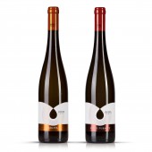
| DESIGN NAME: Beres Tokaj PRIMARY FUNCTION: Wine Label INSPIRATION: The winery is a subsidiary company of Beres Phramaceuticals, the largest Hungarian-owned pharmaceutical company in Hungary. The company is known for Beres Drops, which is a special mineral complex, therefore the logo of the company contains a drop. UNIQUE PROPERTIES / PROJECT DESCRIPTION: The central element of the design is cut drop, which occurs as a continuation of two arcs. The arches symbolize the fertile hills of the area from which the wine was born, which appears as a drop. The line pattern represents the vine stocks. The base wines are colorful, youthful, the premium wines are more severe, distinguished by more subdued colors and metallic stamp foils from each other. The blue label is an exception, the name of the wine is Silver Moon, hence the darker color and the silver metallic foil, according to the client's request. The winery's logo was made with custom designed font. OPERATION / FLOW / INTERACTION: - PROJECT DURATION AND LOCATION: The project started in October 2014 and finished in August in 2015 in Budapest Hungary. FITS BEST INTO CATEGORY: Packaging Design |
PRODUCTION / REALIZATION TECHNOLOGY: Diecut, wine label paper with UV lacquer and metallic stamp foil. Print method: offset SPECIFICATIONS / TECHNICAL PROPERTIES: Dimensions: 115 mm x 75 mm TAGS: wine, label, drop, stripes RESEARCH ABSTRACT: Once I came up with the basic idea of the cut drop shape, research was carried out in the most well-known websites such as Behance, The Dieline, Packaging of The World, Pinterest and Google Image Search, as well as in the larger Hungarian wine specialty stores. I did not find a similar packaging that would have a cut drop shape as central motif, and then I started the actual design. CHALLENGE: - ADDED DATE: 2017-02-22 23:22:06 TEAM MEMBERS (1) : None IMAGE CREDITS: All images: Photographer: Roland Rekeczki |
||||
| Visit the following page to learn more: http://www.rolandrekeczki.com | |||||
| AWARD DETAILS | |
 |
Beres Tokaj Wine Label by Roland Rekeczki is Winner in Packaging Design Category, 2016 - 2017.· Press Members: Login or Register to request an exclusive interview with Roland Rekeczki. · Click here to register inorder to view the profile and other works by Roland Rekeczki. |
| SOCIAL |
| + Add to Likes / Favorites | Send to My Email | Comment | Testimonials | View Press-Release | Press Kit |


