Mind the Sea Showroom Showroom by Honglei Liu - BLVD |
Home > Winners > #54345 |
 |
|
||||
| DESIGN DETAILS | |||||
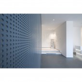
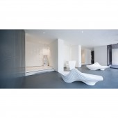
| DESIGN NAME: Mind the Sea Showroom PRIMARY FUNCTION: Showroom INSPIRATION: The inspired design beginning with the visual shock brought on by the in-and-out relation of the architectural volumes and the artful rotation of bricks on the architectural facade. Such design language is refined and applied into interior design. The overlapping and staggered composition of the brickwork creates a geometrical aesthetics on the wall, the subtle lighting layers gives the space a more dynamic impression. UNIQUE PROPERTIES / PROJECT DESCRIPTION: This showroom has more emphasis on conceptual features, aiming to present an environmental, modern and creative branding spirit to visitors. The entire space is mainly toned by white, one may be strongly impressed by the aesthetics of pure minimalism. As the background color, white opens up to all possibilities and embraces the future to a large extent. Touched by the abstract artistic ambiance, the space is overwhelmed with a deep and delicate aesthetic perception. OPERATION / FLOW / INTERACTION: Different from other regular real estate sales galleries, this showroom more aims at conceptual idea and creates an open and minimal effect in the space. PROJECT DURATION AND LOCATION: The project started in December 2015 and finished in November 2016 in Shenzhen, China. FITS BEST INTO CATEGORY: Interior Space and Exhibition Design |
PRODUCTION / REALIZATION TECHNOLOGY: The application of U Home system in the showroom creates a more environmental-friend SPECIFICATIONS / TECHNICAL PROPERTIES: 295 square meters in total, including a TAGS: pure, minimalism, environmental, modern, white, delicate, elegant RESEARCH ABSTRACT: The architectural design concept is continued inside the space. The illumination orientation helps to enhance the beauty of the geometrical abstraction of the space. Attracted and guided by the feature wall, the visitors will be amazed by the pure and unified scenery and displayed ambience both sensually and visually. CHALLENGE: The project used to be a small residence with many solid walls, which is a big challenge to renovate. The showroom and business chatting room have separate entrances, which gives the space an inconsistent feeling. Starting from the creative layout, designers have attempted to break through the limitation of the existing site condition by integrating the two spaces and part of façade as a whole. The glazed curtain wall,gently rotating to face the main road as if a delicate showcase becomes the entrance of the showroom that attracts the view from outside. The steps on the long and narrow corridor connecting reception hall, audio-video room and model room have turned the corridor into an interesting visitor’s journey. ADDED DATE: 2017-02-22 07:09:11 TEAM MEMBERS (3) : Creative Director: Honglei Liu, Senior Designer: Haijun He and Designer: Xiaomei Liang IMAGE CREDITS: Image #1 : Photographer Yun Ouyang, 2016 Optional Image #1: Photographer Yun Ouyang, 2016 Optional Image #2: Photographer Yun Ouyang, 2016 Optional Image #3: Photographer Yun Ouyang, 2016 Optional Image #4: Photographer Yun Ouyang, 2016 PATENTS/COPYRIGHTS: Copyrights belong to BLVD, 2016. |
||||
| Visit the following page to learn more: http://www.blvd.com.cn/en/ | |||||
| AWARD DETAILS | |
 |
Mind The Sea Showroom Showroom by Honglei Liu-Blvd is Winner in Interior Space and Exhibition Design Category, 2016 - 2017.· Read the interview with designer Honglei Liu - BLVD for design Mind the Sea Showroom here.· Press Members: Login or Register to request an exclusive interview with Honglei Liu - BLVD. · Click here to register inorder to view the profile and other works by Honglei Liu - BLVD. |
| SOCIAL |
| + Add to Likes / Favorites | Send to My Email | Comment | Testimonials | View Press-Release | Press Kit |
Did you like Honglei Liu-Blvd's Interior Design?
You will most likely enjoy other award winning interior design as well.
Click here to view more Award Winning Interior Design.


