Miss Seesaw Health Supplements for woman by Existence Design Co., Ltd |
Home > Winners > #54320 |
 |
|
||||
| DESIGN DETAILS | |||||
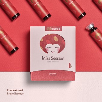
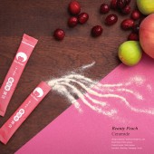
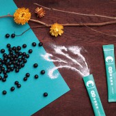
| DESIGN NAME: Miss Seesaw PRIMARY FUNCTION: Health Supplements for woman INSPIRATION: The brand name is designed based on the concept of a seesaw balanced by body health and life.It is a nutrition and health brand for women.The logo of MS presents the original intention of looking after and caring for female consumers. It is designed by combining the first letter M with pattern of heart to constitute a girl’s smiling face,symbolizing health that makes a smile natural and sustains women’s wonderful life. UNIQUE PROPERTIES / PROJECT DESCRIPTION: Miss Seesaw features its intimacy with consumers, being there for women to take care of themselves from the inside out, and refine their self-confidence and beauty over time. The overall and extended design includes brand image, visual language, packaging, text, photography plan, etc., that fully convey a healthy and positive image of the brand . OPERATION / FLOW / INTERACTION: Stay Young with Miss Seesaw Especially designed for women in their 30s, the pink, lemon yellow, and baby blue package of Miss Seesaw is lovely and delightful. Most of the end users appreciate the small pack of various flavored powder which contains rich nutrition and instantly dissolves in water. It is effortless for them to obtain health supplements. Within a better health and skin condition and they feel more energetic and confident, as if time stops at when they were young. PROJECT DURATION AND LOCATION: Marketing planners and designers make the final design after brain stoning and communicating over and over to meet the consensus for about 7 months with the client right in the office in Taiwan. FITS BEST INTO CATEGORY: Graphics, Illustration and Visual Communication Design |
PRODUCTION / REALIZATION TECHNOLOGY: It is designed by combining the capital M with pattern of heart to constitute a girl’s smiling face, symbolizing a charming and decent woman who takes good care of the end users. We made a lot of effort when designing the structure of the box. The double cardboard package aims to add more fun to the product and differentiate it from other similar ones in health supplement market. An encouraged dialogue is printed at the bottom of the box, which warms the consumer’s heart. To match the concept of simplicity, the minimum paper was used as the material of package. It is not a fancy design, yet conveys a healthy and positive image of the brand. SPECIFICATIONS / TECHNICAL PROPERTIES: In order to not only to remain the concept of double cardboard package, and also to keep the resistance and safety of box itself, team have spent quite amount of time to discuss with the client. Finally have come up the one it is right now, which brings out the best packaging design with its own style. TAGS: StayYoung,Golden30 RESEARCH ABSTRACT: - CHALLENGE: - ADDED DATE: 2017-02-22 03:52:37 TEAM MEMBERS (1) : IMAGE CREDITS: [Image #1: Photographer Existence Design, Variations, 2016. ] [Image #2: Photographer Existence Design, Variations, 2016. ] [Image #3: Photographer Existence Design, Variations, 2016. ] [Image #4: Photographer Existence Design, Variations, 2016. ] [Image #5: Photographer Existence Design, Variations, 2016. ] |
||||
| Visit the following page to learn more: http://www.a-adesign.com.tw/%E5%93%81%E7 |
|||||
| AWARD DETAILS | |
 |
Miss Seesaw Health Supplements For Woman by Existence Design Co., Ltd is Winner in Packaging Design Category, 2016 - 2017.· Read the interview with designer Existence Design Co., Ltd for design Miss Seesaw here.· Press Members: Login or Register to request an exclusive interview with Existence Design Co., Ltd. · Click here to register inorder to view the profile and other works by Existence Design Co., Ltd. |
| SOCIAL |
| + Add to Likes / Favorites | Send to My Email | Comment | Testimonials | View Press-Release | Press Kit | Translations |
Did you like Existence Design Co., Ltd's Packaging Design?
You will most likely enjoy other award winning packaging design as well.
Click here to view more Award Winning Packaging Design.


