Hunters' Roots Cafe by Kei Kitayama |
Home > Winners > #53904 |
 |
|
||||
| DESIGN DETAILS | |||||
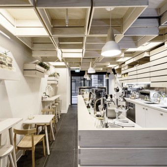
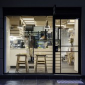
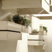
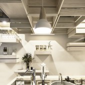
| DESIGN NAME: Hunters' Roots PRIMARY FUNCTION: Cafe INSPIRATION: The brief was to design an interior to match their concept of simple, fresh and natural, as well as to ensure their patrons have an enjoyable visit. The clients cafe concept directed us to use vegetable crates as the design inspiration. It seemed logical to use a container for fresh fruits and vegetables to create a space where they serve food and drink made from fresh ingredients. UNIQUE PROPERTIES / PROJECT DESCRIPTION: The design concept was developed using vegetable crates, a container for fresh ingredients. The idea of a container for fresh fruits and vegetables seems to suit the cafe concept of healthy food using fresh ingredients. The crates used are an abstract form and they are randomly positioned following a geometric grid throughout the premise to create sculptural form. Some are hanging from ceiling containing light fittings, others are positioned on walls forming display shelving and cupboards. OPERATION / FLOW / INTERACTION: The interior space has been filled with series of abstract form of timber crates. They form three dimensional sculptural interior space, which is visible from street and attract pedestrians attention. The timber crates are also forming functional objects, counter bar, shelving, and lighting feature, within the cafe. Suspended timber crates have been positioned carefully to provide suitable ceiling height in different area. Controlled ceiling height and warm feeling that timber provides to the space offer patrons a comfort relaxing environment to enjoy their experience. PROJECT DURATION AND LOCATION: The project started in July 2014 in Melbourne and finished in March 2015 FITS BEST INTO CATEGORY: Interior Space and Exhibition Design |
PRODUCTION / REALIZATION TECHNOLOGY: To hung series of timber crates from ceiling without installing substantial steel structure was one of the design challenge to realise the initial design concept. To reduce the weight of the suspended timber feature, we have used Paulownia timber, which is very light and has similar colour to the intended timber colour tone. SPECIFICATIONS / TECHNICAL PROPERTIES: Total floor area of the project, 30m2 TAGS: Timber Design, Sustainability, Cafe Design, Japanese Architect, Simple Design, Timber Crafting RESEARCH ABSTRACT: We have researched timber specie that is light in weight and suitable for the ceiling feature design. We came across Paulownia timber through our internet research. It used to be a material to make surfboards due to its light weight and rigidness. We obtain a sample, and tested with a sample mock up with our furniture maker, arteveneta, for suitability. It also has similar colour to maple, which we were intending to use for other joinery and furniture elements. The decision to use Paulownia timber made suspended timber feature light weight and did not require additional structure to support them. CHALLENGE: One of challenge was to maintain the same ceiling feature throughout the cafe including the kitchen area. Air circulation for air conditioning was overcome by utilizing the expressed shadow gaps between the suspended timber crates. On the other hand, ceiling above kitchen area had to be sealed to comply with the local food safety regulation. The ceiling above kitchen has rid above the ceiling feature and compressible materials within the shadow gaps between timber crates to satisfy the local regulation as well as to maintain the design intent. ADDED DATE: 2017-02-18 11:41:14 TEAM MEMBERS (1) : IMAGE CREDITS: Itsuka Studio and Toshihiro Takaoka |
||||
| Visit the following page to learn more: http://kitayamakarchitects.com.au | |||||
| AWARD DETAILS | |
 |
Hunters' Roots Cafe by Kei Kitayama is Winner in Interior Space and Exhibition Design Category, 2016 - 2017.· Read the interview with designer Kei Kitayama for design Hunters' Roots here.· Press Members: Login or Register to request an exclusive interview with Kei Kitayama. · Click here to register inorder to view the profile and other works by Kei Kitayama. |
| SOCIAL |
| + Add to Likes / Favorites | Send to My Email | Comment | Testimonials | View Press-Release | Press Kit | Translations |
Did you like Kei Kitayama's Interior Design?
You will most likely enjoy other award winning interior design as well.
Click here to view more Award Winning Interior Design.


