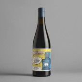
Maquinon Wine bottle by Estudio Maba |
Home > Winners > #53775 |
 |
|
||||
| DESIGN DETAILS | |||||
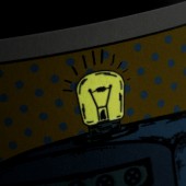
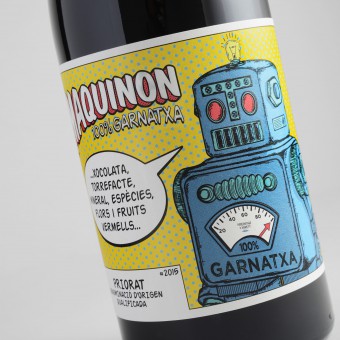
| DESIGN NAME: Maquinon PRIMARY FUNCTION: Wine bottle INSPIRATION: Maquinon already had an identity, a small smoking robot from the 1960s. Back then it was considered powerful and robust, a touch unsettling, with a bit of smoke coming out of its mouth. The tasting notes of the wine spoke about a clean and bright red. Our intention was to design a packaging full of light, colour and rythm. The idea was to refresh a wine from the Priorato denomination of origin, so full of peculiar personality. A vibrant design, just like the tasting notes. Impossible to overlook. UNIQUE PROPERTIES / PROJECT DESCRIPTION: The aesthetics were clear, pop art and comic books from the 1960s, just when robots entered people homes. We dusted off that tiny object and made it shine radiantly. It is easy to get along with our little robot buddy. Its brief strokes and spot colors instill it with life. The chosen typography conveys movement and character. The finishing touches make the rest: varnished inks give a round finish and make handling it even sweeter. Clean and bright… like a small lightbulb shining in the dark. In case somebody missplaces it. OPERATION / FLOW / INTERACTION: This fancy label brights in the dark, just in a small bulb located on top of the smoking robot. PROJECT DURATION AND LOCATION: The design was realized in Murcia, Spain during 3 months from December 2015 to March 2016. FITS BEST INTO CATEGORY: Packaging Design |
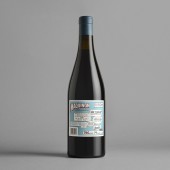
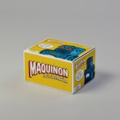
PRODUCTION / REALIZATION TECHNOLOGY: Label printed on Tintoretto paper, Impression with dry blow, inflatable varnish and luminescent ink. SPECIFICATIONS / TECHNICAL PROPERTIES: Relief printing, inflatable varnish and luminescent ink in Tintoretto paper by Fedrigoni. The design uses a Bourgogne bottle, 300 mm high and 82 mm wide. The front label is 95 mm × 130 mm and the back label is 75 mm × 90 mm. The capsule is made of printed tin with the lightbulb icon embossed on top. TAGS: wine, bottle, design, labelling, RESEARCH ABSTRACT: A study of the Priorato denomination of origin was necessary. At the same time we must maintain the daring spirit of the Casa Rojo brand. As drinking wine becomes more and more fashionable, we are able to use even more daring graphics. We were able to refresh the product with shiny, colourful elements. Maquinon is a biodynamic wine, which is a quite particular feature. Its packaging should convey rhythm. It had to steer away from the usual formulae found in organic produce. CHALLENGE: The main goal was to stand out in the wine shelves. Wine is a social product. The aim was making Maquinon the choice for those consumers visiting specialised shops, looking for something surprising. Its box is both packaging and display unit, and so the value is evident even before you take it out. One complicated element was the integration of graphic and legal requirements on its back label. It was a challenge to keep the same character that guided the main design. The result is brilliant. ADDED DATE: 2017-02-17 09:55:53 TEAM MEMBERS (3) : Miguel Angel del Baño, Adrián Marzal and Beatriz Suárez IMAGE CREDITS: Casa Rojo |
||||
| Visit the following page to learn more: https://goo.gl/9LhTPK | |||||
| AWARD DETAILS | |
 |
Maquinon Wine Bottle by Estudio Maba is Winner in Packaging Design Category, 2016 - 2017.· Read the interview with designer Estudio Maba for design Maquinon here.· Press Members: Login or Register to request an exclusive interview with Estudio Maba. · Click here to register inorder to view the profile and other works by Estudio Maba. |
| SOCIAL |
| + Add to Likes / Favorites | Send to My Email | Comment | Testimonials | View Press-Release | Press Kit |
Did you like Estudio Maba's Packaging Design?
You will most likely enjoy other award winning packaging design as well.
Click here to view more Award Winning Packaging Design.


