DESIGN NAME:
Others Design Touch
PRIMARY FUNCTION:
Reception center
INSPIRATION:
The one concept of this whole exhibition is comfortable. Man has his own living attitude and his own dreaming castle. By way of our design could let them slow down their step to feel the relaxing and tell them build up their home to seek the dreaming. Creating the luxurious illusion is not the purpose. The point of view is sense activity and feeling touch. We catch this soul and emphasize this soul to give our guest who enjoy and please this special area that we provide against when they moving around at ours.
UNIQUE PROPERTIES / PROJECT DESCRIPTION:
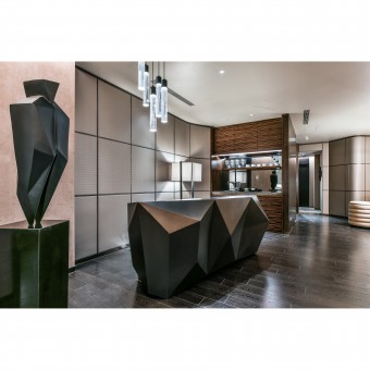
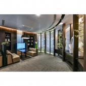
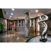
There are 3 different floors in this case. According to our need, we divide these 3 floors into Concierge Area, Distribution Area, and VIP Area. We use Art Deco, Surrealist and Rationalist to mix up the style of gorgeous art for the pattern, decoration and furniture, to show the mysterious atmosphere of classic. All 3 floors have their different atmosphere. We try our best to exhibit the natural features of the furniture. The sophisticated classic that showed at the natural furniture exhibit was not only futuristic, but also a gleam of memories.
OPERATION / FLOW / INTERACTION:
We try to use the Art Deco, which awakens the decorative art, to exhibit the classic beauty of structure. The large bookcase designed in the shape of a chessboard creates the relaxing and delicate reading and discussing atmosphere. We use the similar design on the featured wall decoration. The handmade egg clack grain paint pair with the rational bronze stripe, the rigorous geometric image and limited illusion merge into a unique inner atmosphere.
PROJECT DURATION AND LOCATION:
The project finished in March 2016 in Kaohsiung City, Taiwan.
FITS BEST INTO CATEGORY:
Interior Space and Exhibition Design
|
PRODUCTION / REALIZATION TECHNOLOGY:
Through the rational arrangement of decorative screen of different angles and size, we reannotate the environment effect on stripes of the stones. With the mosaic stripes receptionist desk, we increase the joyfulness of people. Through the comparison of the similar attraction, the whole area can be surrounded like echo..
SPECIFICATIONS / TECHNICAL PROPERTIES:
753.72 square meters
TAGS:
Reception center
RESEARCH ABSTRACT:
The foundation is located on traffic circle and it courses many irregular angle of inside space. In order to reform the unease space become the wider view, there are some others design among same others distribution center which exercising a few propinquity of element and erasing a few slightness of detail. No emphasizing the divide, no confining the vision, only for one perfect unit that call – holism’s creation.
CHALLENGE:
We try the futurist of Surrealist to create a wise classic and beauty. Curve is a special feature. We use different curves on the wall design, and carefully chose movable decoration. This contrived environment with shining leather and natural stones and surely increase the area experience. It will motivate the strong sense of view and sensation, which will perfect the taste and style, trigger the emotion of feeling and sensing.
ADDED DATE:
2017-02-16 10:07:39
TEAM MEMBERS (1) :
Tsan-Hen Li
IMAGE CREDITS:
Photo by Ar-Her kuo
|


