TOMI - City’s Best Friend Interactive screen by TOMI WORLD |
Home > Winners > #53083 |
 |
|
||||
| DESIGN DETAILS | |||||
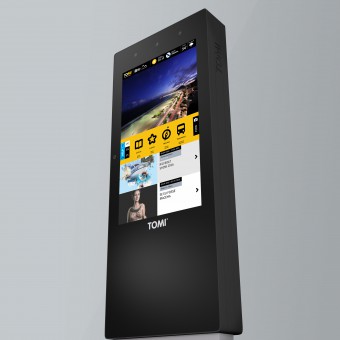
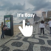
| DESIGN NAME: TOMI - City’s Best Friend PRIMARY FUNCTION: Interactive screen INSPIRATION: Firstly, the inspiration came as a technical challenge of how to satisfy visitors needs on location and local information, as well as local citizens on services and cultural, keeping a fun engagement from users. Second, how to do it through a hyperbolic interface and stimulate the sense of belonging by the users. Last, but not least, how to merge the lessons learned from two main digital media (TV and Mobile) and public signage, in order to create an design proposal fitting on the living rooms of cities. UNIQUE PROPERTIES / PROJECT DESCRIPTION: TOMI design proposes a new equilibrium in the paradigm of human computer interaction in digital urban equipments, merging both the user experience over corporate TV and mobile. This approach maximizes the call-to-action rate of users who read and reduces the learning curve of those who interact. The proposed equilibrium also targets the chameleonic emotional engagement of the urban users with digital media equipments. TOMI challenges aesthetic ties with the ergonomy, public spaces and users. OPERATION / FLOW / INTERACTION: TOMI is like a public hyperbolic smartphone in urban spaces. The easy interaction invites to action to find the contents and services related with user's geolocation and diverse local trending information. The interaction requested to users is facilitated by a clean design that triggers emotional responses. This is emphasized by a dual approach aiming either users that interacts, as well as the ones that read and consume ads (targets of the call-to-action suggestions in the interface, eg., images, pictorial stylization, headline text, etc,). PROJECT DURATION AND LOCATION: All started in Portugal 4 years ago and in 2016 TOMI was deploy to Brasil, after being available in Lisbon among other cities in Portugal. |
PRODUCTION / REALIZATION TECHNOLOGY: Design oriented to the new paradigm of public screens: 100% Multi-Touch and Multi-user interface for Full HD Screens without external buttons, such as hard keyboard. Enticing people to interact with a large screen for public urban places through the aesthetic of the equipment, design of advanced features (eg., icons, color pallet, layers triggering emotional reaction) and error probability reduction on user interaction. Participatory design practice with users, media professionals, marketers and people from several cultural and technical backgrounds. SPECIFICATIONS / TECHNICAL PROPERTIES: 55" Full HD screen size and multi-touch surface. TAGS: Multi-Touch interface, Multi-user interface, Interactive public screen, Urban places immersion, Urban ergonomy, Multilayer user interfaces, Digital urban equipments, Online public screen RESEARCH ABSTRACT: Collaborative and adaptive research. Goal to drive users on finding local information. Mapping out the key aspects of the product. Blueprint showing the touch points and actions of the user in the interface. Consumer Journey Map forecasting the steps of several designed Personas. Observation of user interaction with the prototype. Participants from several backgrounds. Redesign through several interactions of the several versions. Thousands of interactions and no frustrating feedback from users. CHALLENGE: The most exciting but also hardest part of the design work was the merge between Corporate TV and Mobile. This have included defining the key points of both designs and identify the dropped actions from users. Other challenge was to deal with the frontiers, the technological and the legal on user data usage. We have found that the best user interaction design it is not always the best practice for users. ADDED DATE: 2017-02-03 12:30:51 TEAM MEMBERS (6) : UI/UX Designer & Creative Director: Bruno Lamelas, Project Owner & Director: José Agostinho, Programmers Team Manager: José Carlos Cardoso, Illustrator & Photo Editor: Paula Rodrigues, Programmer: Vasco Simões and Programmer: Tiago Morgado IMAGE CREDITS: TOMI WORLD, 2016. |
||||
| Visit the following page to learn more: http://www.tomiworld.com | |||||
| AWARD DETAILS | |
 |
Tomi-City’s Best Friend Interactive Screen by Tomi World is Winner in Interface, Interaction and User Experience Design Category, 2016 - 2017.· Read the interview with designer TOMI WORLD for design TOMI - City’s Best Friend here.· Press Members: Login or Register to request an exclusive interview with TOMI WORLD. · Click here to register inorder to view the profile and other works by TOMI WORLD. |
| SOCIAL |
| + Add to Likes / Favorites | Send to My Email | Comment | Testimonials | View Press-Release | Press Kit |
Did you like Tomi World's Interface Design?
You will most likely enjoy other award winning interface design as well.
Click here to view more Award Winning Interface Design.


