DESIGN NAME:
Boof
PRIMARY FUNCTION:
Fast Food
INSPIRATION:
Regarding the name of the project ("Boof"), which means owl, we tried to do a survey on the owl lifestyle and apply the results to the interior design, which could be an important element of its lifestyle. Consequently, we opted the owl habitat (the trunk clefts) and ultimately applied the simplified and symbolized theme to the interior design.
UNIQUE PROPERTIES / PROJECT DESCRIPTION:
In regard to the name and the old and new logo belonging to this project, we attempted to focus on Boof (owl) lifestyle and extending it to the whole project, which is the issue that inspired us. Our concept for the interior design is inspired by the owl habitat, which is the cleft on the trunk of trees.
OPERATION / FLOW / INTERACTION:
In addition to the mentioned, we had to take into account the climate of Asaluyeh and also the culture and behavioral characteristics of the people.
Asaluyeh Port is a seaport and the capital of Asaluyeh county in south of Iran, along the Persian Gulf and the climate is hot and humid. Other than considering the climate, what we contrived was to adopt some design concepts that could be applied to the other Boof stores as well.
Also, the yellow colors we chose to be used in the room along beside the grey color, making it more gorgeous, enhances the sense of a tree, which is an important item by itself.
PROJECT DURATION AND LOCATION:
The project started in Jun 2016 and finished in August 2016 in Asalooyeh
Asaluyeh Port, capital of the Asaluyeh county in south of Iran, along the Persian Gulf
FITS BEST INTO CATEGORY:
Interior Space and Exhibition Design
|
PRODUCTION / REALIZATION TECHNOLOGY:
the opted material for the floor of the room is Epoxy floor The reason why we used this material was the appropriate variety of the colors and that there was no tiles meaning that there was no limitations, which was practical according to the design. And this was crucial. It is light and compact.Also another important factor of this material which is critically important to the sanitation of the restaurant, is being washable.
The selected material for the walls is Knauf. As for the grooves, we considered paint.
The lighting system of the roof is Barrisol.
SPECIFICATIONS / TECHNICAL PROPERTIES:
Since the project was about renovation, the original plan was available and only the alteration of the partition walls was permitted.
The total area of the plan was 550 m2 and the kitchen, restroom, stockroom of foods and also the sitting area of the restaurant were parts of the physical planning to be included in design. There also existed a 166 m2 of area on the first floor, that we decided to consider the restroom and stockroom right in there. Kitchen, the restaurant counter and the self-service, were considered at one end of the room, and we located the sitting area of the restaurant next to the entrance, in the front part.
TAGS:
Interior Design, Fast Food, Trunk, Owl, Owl life style
RESEARCH ABSTRACT:
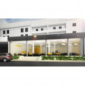
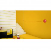
we embarked on our preliminary survey by investigating and studying through a number of books, written on the restaurant and fast food. Then we reviewed the similar cases in books, magazines and various websites and then relating to the owl lifestyle and then according to the essential items and the requirements of the project, we did the zoning of the plans and categorized the demands. Ultimately we designed the exterior part of the project and even the stairs, in alignment with the interior design.
After we studied about the owl in books and magazines, its habitat inspired us and we adopted our concept from the trunk clefts.
CHALLENGE:
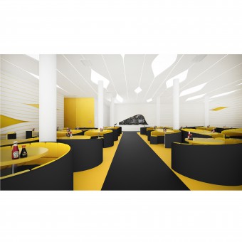
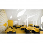
The main challenge to this project was the existence of too many columns that were essential to maintain. Most importantly we had to cover them through smart design solutions so as not to damage the architecture. According to our contrivance, the most optimized way was to fill the area around the columns with the furniture and chairs.
The other issue was the type of design and the concept was pretty pertinent to the title of the project which was the famous "Boof" restaurant. After doing a survey on the owl lifestyle, we chose the trunk cleft as our basic concept and a simplified and symbolized form of this was applied to the whole project. The counter had connection with its customers through the clefts, the flower boxes had a cleft theme, located on the wall and the plants mostly selected from Sansevieria specie that was compatible with the internal environment and was easy to maintain compared to the other species. On the roof we had clefts as well, designed in a specific logical pattern, scattered on the surface, some of them covering the columns. Defining two colors for the floor, we created attraction to the counter.
Moreover, another important factor considered in the interior design of this restaurant is the practical arrangement of the furniture, The furniture is organized in a way that the maximum number of chairs are being placed in the least area possible. In this case owl eyes which also exists in the newly updated logo, has been the main concept and the design also benefited from the properties of the circle form, providing more space so that more people could sit at one table.
Next issue that should have been considered and solved in this project is that the number of columns in the room could be a hindrance to the design and function. And we should have adopted the optimized design solutions. In this project we attempted to place the furniture next to the columns to minimize the useless spaces created by the columns and make use of the column as an important element in the architecture of the project to create magnificence.
ADDED DATE:
2016-12-22 17:21:54
TEAM MEMBERS (2) :
Mehrkameh Veiseh and Hesam Shahidi
IMAGE CREDITS:
Architect, 3d Max, Vray (Mehrkameh Veiseh)
Architect , Graphic designer, Post Production, Photographer (Hesam Shahidi)
|


