Atxiaoge Express Delivery Application by Zhan Xiao |
Home > Winners > #52247 |
 |
|
||||
| DESIGN DETAILS | |||||
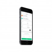
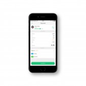
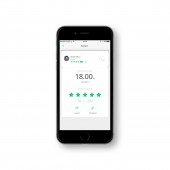
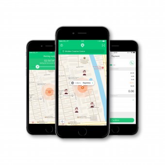
| DESIGN NAME: Atxiaoge PRIMARY FUNCTION: Express Delivery Application INSPIRATION: People often look for couriers because they want to send couriers. The usual way is to call, but the way users access these numbers is usually the Internet. So why not directly through the network to call the courier? So our team designed this mobile phone to find around the courier to pick up couriers. UNIQUE PROPERTIES / PROJECT DESCRIPTION: Atxiaoge is a one step courier service platform, through innovative technology to provide consumers with a new type of online mail, courier inquiries, logistics tracking services to break the user and courier company, courier information barrier between the more fast, safe delivery experience. OPERATION / FLOW / INTERACTION: Users can find the nearest courier in the home page, select the address and then call the courier. Courier orders will be made after the phone with the user to determine the detailed address information. Courier pick up pick up, tell the user courier costs, the user to pay the cost of the phone after the end of the operation. PROJECT DURATION AND LOCATION: The project started in March 2016 in Hangzhou and finished in August 2016. FITS BEST INTO CATEGORY: Interface, Interaction and User Experience Design |
PRODUCTION / REALIZATION TECHNOLOGY: Global Positioning System technology SPECIFICATIONS / TECHNICAL PROPERTIES: ios, Android TAGS: ux, ui, application, moblie, express RESEARCH ABSTRACT: 1.visibility In the product function to have enough visibility, users are able to clearly understand the task of what to do next, if this function may be hidden too deep, the user is hard to find and use it.In simple terms, is through the operation area, the elements such as colors and icons highlight the core functions of display, add some minor features hidden. 2.Natural Is simply a product to be "natural", accords with the operation of nature.Let users don't need captions can easily get started.For an example in life, my 4 year old nephew use it very easy to fit in the lock, it will be not learn to use. 3.Consistency A product structure, interface, style and operation should have consistency. ios, for example, have the ios Human Interface Guidelines, Android, have the Material Design, they are on the user interface and user experience Design specification in detail, makes the product has high degree of consistency. 4.Cognition Users have a clear understanding of a function and it's easy to know how to use it.Design should be based on the user's mental model, we do not design a very logical, authentic and accurate model.For users, the interface is not very effective, also not understand, most users don't care about is how realistic program. 5.Emotional design I have understood emotional design is a kind of "caring" design, the most concerned about is the user's goals and requirements.Emotion CHALLENGE: The most challenging part from, online real time communication between users and offline Courier, when a user initiated an order, Courier need to rob the list, the user real-time understanding of Courier distance themselves, users can also through the mobile phone call Courier. ADDED DATE: 2016-12-20 02:02:20 TEAM MEMBERS (2) : Creative Director: "Zhan Xiao", and Designer:"Shi Wen". IMAGE CREDITS: Main image #1: Zhan Xiao |
||||
| Visit the following page to learn more: http://www.behance.net/dave1027 | |||||
| AWARD DETAILS | |
 |
Atxiaoge Express Delivery Application by Zhan Xiao is Winner in Mobile Technologies, Applications and Software Design Category, 2016 - 2017.· Read the interview with designer Zhan Xiao for design Atxiaoge here.· Press Members: Login or Register to request an exclusive interview with Zhan Xiao. · Click here to register inorder to view the profile and other works by Zhan Xiao. |
| SOCIAL |
| + Add to Likes / Favorites | Send to My Email | Comment | Testimonials | View Press-Release | Press Kit |
Did you like Zhan Xiao's Mobile Design?
You will most likely enjoy other award winning mobile design as well.
Click here to view more Award Winning Mobile Design.


