DESIGN NAME:
Kellyone
PRIMARY FUNCTION:
Packaging Design
INSPIRATION:
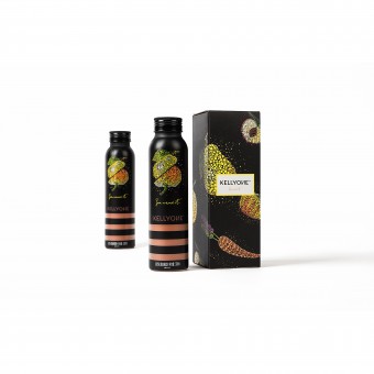
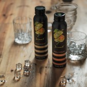
The colorful illustration starts with a simple dot, symbolizing one's innate mindset. It evolves into a galaxy-like dot-composed fruit veggie shape, based on the actual ingredients. This state of mind reflects an attitude to present healthy nutrition to an energetic clientele.
UNIQUE PROPERTIES / PROJECT DESCRIPTION:
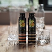
Kellyone is a beverage product produced by Hongsheng Beverage Group, one of the beverage giant in China. The nova innovative drink is dedicated to provide unique beverage service to the young audiences. The most creative idea is that the drinks can be customized from the combination of 100 garden stuffs, hence meaning unlimited combinations.
OPERATION / FLOW / INTERACTION:
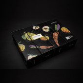
The packaging uses craft-paper in a ‘cell-like’ installation. Once the novel structure is opened fully, the product is nicely displayed 360 degrees.
PROJECT DURATION AND LOCATION:
The project started in May 2015 in Beijing and finished in July in Beijing.
FITS BEST INTO CATEGORY:
Packaging Design
|
PRODUCTION / REALIZATION TECHNOLOGY:
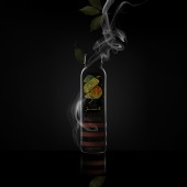
The bottle design is fairly simple. The message lies behind is that plain things can be endowed into something extraordinary. The bottle measures 53.3mm in diameter, volumes 300ml, aluminum foil seal with black hemming cap. The label creation begins with a simple dot. Dot is a simple but intriguing symbol. It represents the innate mindset lies inside people’s heart. Moreover, infinite dots transform into the shape of ingredients used in the drink, which symbolizes the infinite selection within customer’s grasp.
SPECIFICATIONS / TECHNICAL PROPERTIES:
The bottle measures 53.3mm in diameter, volumes 300ml, aluminum foil seal with black hemming cap. The packaging uses craft-paper in a ‘cell-like’ installation. Once the novel structure is opened fully, the product is nicely displayed 360 degrees.
TAGS:
Packaging, Young, Health
RESEARCH ABSTRACT:
The colorful illustration starts with a simple ‘dot’, symbolizing the ‘innate mindset’. It evolves into a ‘galaxy-like’ (infinite) fruit veggie shape, based on the actual ingredient(s). This state of mind reflects an attitude to present healthy nutrition to an energetic clientele. With seemingly ‘infinite’ choices, one can choose among 100 fruits and/or veggies. The packaging uses craft-paper in a ‘cell-like’ installation. Once the novel structure is opened fully, the product is nicely displayed 360 degrees.
CHALLENGE:
The bottle design is fairly simple. The message lies behind is that plain things can be endowed into something extraordinary. The bottle measures 53.3mm in diameter, volumes 300ml, aluminum foil seal with black hemming cap. The label creation begins with a simple dot. Dot is a simple but intriguing symbol. It represents the innate mindset lies inside people’s heart. Moreover, infinite dots transform into the shape of ingredients used in the drink, which symbolizes the infinite selection within customer’s grasp.
ADDED DATE:
2016-12-07 07:13:06
TEAM MEMBERS (1) :
Dongdao Design Team
IMAGE CREDITS:
Dongdao Creative Branding Group, 2016.
|


