eo Beauty and Health Identity and packaging by Tak Cheung - Studio 10 Design |
Home > Winners > #51962 |
 |
|
||||
| DESIGN DETAILS | |||||
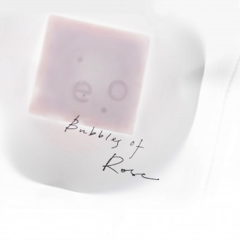
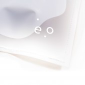
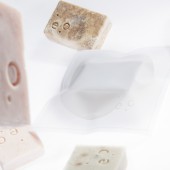
| DESIGN NAME: eo Beauty and Health PRIMARY FUNCTION: Identity and packaging INSPIRATION: EO beauty's products are all handmade and use only natural ingredients. We designed the packaging of one of their signature product, the beauty soap. As their products contain no artificial colors and preservatives, we decided to create a clean design that can showcase that. UNIQUE PROPERTIES / PROJECT DESCRIPTION: We designed the packaging of one of our client's signature product, the beauty soap. As their products contain no artificial colors and preservatives, we decided to create a clean design that can showcase that. The main visual that we use is an irregular shape that symbolizes soap dissolving in water. By using translucent paper in the packaging, consumers will be able to see the soap as it is, natural, uncovered. Besides, stitching was used to give the packaging a more unique and handmade feel. OPERATION / FLOW / INTERACTION: Translucent paper allow customers to see the soap's shape and color without opening the packaging. Moreover, the texture of the paper is very smooth to enable customers to relate their imaginations to silky soft skin. The final element of this packaging is the stitching. This gives the handmade feel to this packaging that corresponds to the brand image that is minimalist, simple, clean and natural. PROJECT DURATION AND LOCATION: This product is launched in January 2016 and is still one of the best-selling product of our client. FITS BEST INTO CATEGORY: Packaging Design |
PRODUCTION / REALIZATION TECHNOLOGY: Translucent paper was used in this packaging so that consumers will be able to see the soap as it is, natural, uncovered. Besides, white stitching was also used to give the packaging a more unique and handmade feel. SPECIFICATIONS / TECHNICAL PROPERTIES: Width 150mm x Height 150mm TAGS: Skincare, branding, packaging design, white, clean, natural, handmade RESEARCH ABSTRACT: We studied as many handmade skincare and beauty soap brands as we can from Hong Kong and other places around the world. Most brands use raw material paper and craft paper to create their packagings. However, we created this revolutionary packaging for our client so that her brand stands out from others. Moreover, we wish to convey our client's brand image and vision through our design. CHALLENGE: One of our biggest challenge is that our client is still a very new company. And with the high number of handmade skincare brands in Hong Kong, it is very difficult to create an impression among her potential customers. Moreover, she has limited budget for this project and hence we have to work to create the best effects with the least amount of money.. ADDED DATE: 2016-12-03 13:13:27 TEAM MEMBERS (2) : Designer: Tak Cheung, Nancy Chan and Creative Director: Tak Cheung IMAGE CREDITS: All images: Studio 10 Design |
||||
| Visit the following page to learn more: http://www.studio10.hk/ | |||||
| AWARD DETAILS | |
 |
Eo Beauty and Health Identity and Packaging by Tak Cheung-Studio 10 Design is Winner in Packaging Design Category, 2016 - 2017.· Read the interview with designer Tak Cheung - Studio 10 Design for design eo Beauty and Health here.· Press Members: Login or Register to request an exclusive interview with Tak Cheung - Studio 10 Design. · Click here to register inorder to view the profile and other works by Tak Cheung - Studio 10 Design. |
| SOCIAL |
| + Add to Likes / Favorites | Send to My Email | Comment | Testimonials | View Press-Release | Press Kit |
Did you like Tak Cheung-Studio 10 Design's Packaging Design?
You will most likely enjoy other award winning packaging design as well.
Click here to view more Award Winning Packaging Design.


