Veneno Brewery Labels New Beer Labels by Together & Agência 750 |
Home > Winners > #51179 |
 |
|
||||
| DESIGN DETAILS | |||||
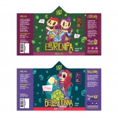
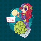
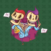
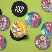
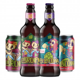
| DESIGN NAME: Veneno Brewery Labels PRIMARY FUNCTION: New Beer Labels INSPIRATION: We wanted to create characters that really spoke with their consumers, something very strong and unique, and at the same time charismatic. Our inspiration came mainly from the mexican Day of the Dead, a very rich and strong culture that brings us an interesting relationship between death, skeletons and art. As the name of the brand and the labels are all poisons, we thought is was the perfect path to follow. UNIQUE PROPERTIES / PROJECT DESCRIPTION: Veneno needed to design their new beer labels, to be aligned with their new brand strategy and core values. They asked for a modern, vibrant and unique approach, focusing always on their main elements: the skeletons. OPERATION / FLOW / INTERACTION: We wanted to create charismatic characters and vibrant labels that could easily become collectibles within beer fans and also make the brand truly recognizable inside beer pubs/bars and grocery stores/supermarkets. PROJECT DURATION AND LOCATION: The project started in January 2016 and it's still ongoing, with two more labels to be done. FITS BEST INTO CATEGORY: Food, Beverage and Culinary Arts Design |
PRODUCTION / REALIZATION TECHNOLOGY: The label was printed in matte metallic adhesive paper, to give a more classy look and make the colors pop-up. SPECIFICATIONS / TECHNICAL PROPERTIES: The bottle labels have 190 x 112 mm and the can labels have 210 x 116 mm. TAGS: beer, craft, poison, beverage, label, skull, skeleton, bootle, can, design RESEARCH ABSTRACT: After conducting benchmark research, we promoted a workshop with the client to get a better understanding of their core values and new brand strategy. At the same time, several interviews with their target audience were conducted, with the goal to get insights for the visual identity of the labels. The main feedback was that the brand was defined by an element from their previous logo, the skeleton. That is the reason why this element was brought back on the labels, in the form of illustrated characters, and this approach created a successful connection between the brewery and their audience. CHALLENGE: We wanted to have a strong, impactful, vibrant and fun label identity that could be easily replicated throughout they whole experience and materials. It was also a challenge to find the balance between the illustrations & identity and the legal content that the labels should have. ADDED DATE: 2016-10-11 01:27:10 TEAM MEMBERS (2) : Graphic Designer & Creative Director - Dudu Torres (Together) and Illustrator - Eder Minetto (Agência 750) IMAGE CREDITS: Together Veneno Brewery |
||||
| Visit the following page to learn more: http://cervejariaveneno.com.br | |||||
| AWARD DETAILS | |
 |
Veneno Brewery Labels New Beer Labels by Together & Agência 750 is Winner in Packaging Design Category, 2016 - 2017.· Read the interview with designer Together & Agência 750 for design Veneno Brewery Labels here.· Press Members: Login or Register to request an exclusive interview with Together & Agência 750. · Click here to register inorder to view the profile and other works by Together & Agência 750. |
| SOCIAL |
| + Add to Likes / Favorites | Send to My Email | Comment | Testimonials | View Press-Release | Press Kit |
Did you like Together & Agência 750's Packaging Design?
You will most likely enjoy other award winning packaging design as well.
Click here to view more Award Winning Packaging Design.


