|
|
|
|
|
DESIGN DETAILS |
DESIGN NAME: The Rays
PRIMARY FUNCTION: Lobby
INSPIRATION: This is a challenging site with no natural light, numerous ceiling beams, floor beams and a very low ceiling.
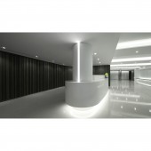
The location of the reception area is carefully designed to surround the existing square column to make it feel like a whole tailor made unit.
As the ceiling heights are very low, we used a number of design features to create an illusion of height.
UNIQUE PROPERTIES / PROJECT DESCRIPTION: A revitalization project to convert an old industrial building to a commercial office building.
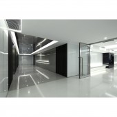
Light troughs are evenly distributed throughout the ceiling and extending to the surrounding space to conceal the numerous ceiling and floor beams with a concept of sustainability and continuity.
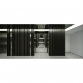
As the ceiling heights are very low, we used a number of design features to create an illusion of height. For example, we lowered the reception counter tops and used dark wooden stripes and mirrors to lengthen the look of the walls. Also varying the width of the white coloured glass wall resonate the theme of lines and functions to hide the service doors. The glasses/mirrors also reflect light, making the space, higher, bigger and lighter.
OPERATION / FLOW / INTERACTION: Client would like to make the dark space feel brighter, and making the space looks spacious and ceiling looks higher.
PROJECT DURATION AND LOCATION: The project started in June 2015 and completed in September 2015 in Hong Kong.
FITS BEST INTO CATEGORY: Interior Space and Exhibition Design
|
PRODUCTION / REALIZATION TECHNOLOGY: Plastic Laminate, White & Black colored back glasses, Mirrors, Hairline Stainless Steel, Corian, marble
SPECIFICATIONS / TECHNICAL PROPERTIES: Total area of the main lobby including Reception counter, lift lobby and waiting area is approximately 500 sqm. With numerous ceiling beams, floor beams, columns and a very low ceiling from 2065mm to 2440mm.
TAGS: office main lobby, office lift lobby, clean, smooth flow
RESEARCH ABSTRACT: For the reception counter, we deliberately design a streamlined element at reception counter, make round the square column with a vertical light strip at one side to make it feel lighter.
Streamlined shape of reception counter making a big contrast to the sharp edge elements surrounding.
White and grey color tone separate the main lobby and lift lobby giving a strong feeling of the two zones.
CHALLENGE: Main lobby is located on the First floor, a challenging site with no natural light, numerous ceiling beams, floor beams, columns and a very low ceiling from approximately 2065mm to 2440mm.
ADDED DATE: 2016-09-30 09:23:42
TEAM MEMBERS (1) : Vstudio - Vanessa Ng
IMAGE CREDITS: Photographer Raymond Tam, Oneplus Studio
PATENTS/COPYRIGHTS: Vstudio Limited
|
Visit the following page to learn more: http://www.vstudio.hk |
|
CLIENT/STUDIO/BRAND DETAILS |
|
NAME: Client: The Rays
PROFILE: Vstudio Limited is a Hong Kong-based design firm.
Vanessa Ng, Founder & Director of Vstudio graduated from the School of Architecture. University of Brighton in the United Kingdom gaining a BA(Hons) degree in Interior Architecture.
Vstudio offers unique, timeless and functional designs, with projects ranging from private residences to hospitality venues and workplaces.
Vstudio's precedential objective is to understand their clients' needs and requirements and to create a place with its own character to ensure it's distinctiveness.
Each design project regardless of its size is treated with the same professionalism and enthusiasm to deliver pure perfection. Ultimately, it is these qualities that make Vstudio unique!
|
|
|
COMMENTS |
Giulia Esposito |
Comment #4042 on December 25, 2022, 9:56 am |
I am absolutely amazed by the beauty of "The Rays". Every detail of the lobby is thoughtfully designed and crafted. The textures, colors, and materials used together create an atmosphere of tranquility and peacefulness. Even the lighting has been carefully chosen to provide an elegant and inviting ambience. I am in awe of the level of detail and dedication put into this work. It is truly remarkable that such a beautiful and functional space can be created. Congratulations to Vstudio Limited for their success in winning the A' Design Award.
|
Adam Harris |
Comment #38089 on January 3, 2023, 12:15 pm |
I am truly in awe of the amazing work Vstudio Limited have achieved with The Rays. The results are incredibly impressive and speak to the skill and creativity of the design team. It is evident that a great deal of thought and research has gone into the project, as each element has been carefully chosen to create an illusion of height and to make the most of the limited space. The light troughs and mirrors used to conceal the ceiling and floor beams stand out, offering a unique and sustainable design feature that helps to bring the whole lobby to life. The Rays is truly a fantastic example of interior design and I congratulate Vstudio Limited for their achievement.
|
Chloe Turner |
Comment #42929 on January 3, 2023, 2:04 pm |
I am in awe of the designer's skillful manipulation of the challenging site. In spite of the numerous ceiling beams, floor beams and low ceiling, they have created an incredible reception area that looks as though it was tailor made for the space. The illusion of height achieved by their design choices is remarkable and I am impressed by their creativity and ingenuity. This work is a testament to the designer's skill and truly deserving of the A' Design Award.
|
Mark Allen |
Comment #43634 on January 3, 2023, 2:22 pm |
This beautifully designed lobby is an inspiring example of how to make the most of an existing space with limited natural light, numerous beams and low ceilings. The clever use of light troughs, dark wooden stripes, mirrors and varying widths of white coloured glass wall creates an illusion of height and a sense of continuity that brings the space together. The reception counter is carefully designed to surround the existing square column and the use of streamlined shapes and contrasting colors creates a strong feeling of two distinct zones. Congratulations on creating such an impressive work!
|
Elisabeth Clark |
Comment #43748 on January 3, 2023, 2:25 pm |
I am so impressed with Vstudio Limited's work "The Rays"! The design features utilized to create the illusion of height and the streamlined elements make this lobby truly unique. The thoughtful use of light troughs, dark wooden stripes, mirrors, and white glass walls to conceal the service doors are truly beautiful and create a feeling of continuity and sustainability. The contrast between the sharp edges and the streamlined reception counter is stunning. I'm also really impressed with the research and thought put into this project - the use of color tones to separate the main lobby and lift lobby demonstrates the attention to detail and creates a strong visual distinction. Well done Vstudio Limited!
|
|
|
Did you like Vstudio Limited's Interior Design?
You will most likely enjoy other award winning interior design as well.
Click here to view more Award Winning Interior Design.
Did you like The Rays Lobby? Help us create a global awareness for good interior design worldwide. Show your support for Vstudio Limited, the creator of great interior design by gifting them a nomination ticket so that we could promote more of their great interior design works.
|
|
|
|
|