DESIGN NAME:
Tazze
PRIMARY FUNCTION:
Nuts, dried fruits
INSPIRATION:
New packages have been designed in consideration of aspects such as taste, freshness, price perception and solid packaging. Differentiated promises of nuts and dried fruits for different target groups have been addressed in an integral but distinguishing design concept.
The main inspiration about this project is the real taste of the product. The fact that the product is tasty and fresh, the visuals had to be tasty like it’s taken for a food styling magazine. The brand has different product lines for different target audiences but yet they all belong to the same brand with it’s graphic language.
UNIQUE PROPERTIES / PROJECT DESCRIPTION:
we created a new brand architecture for our client focusing on the priorities individuals consuming nuts in Turkey.
our target was:
Designs reflecting the quality products of the brand.
Making difference compared to the competitors.
Emphasizing the freshness and taste of the products.
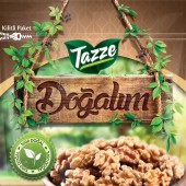
Other brands use different photos with different angles and light of the nut variations on their packages. First, our variations of 3 product lines has the same identical angle, light, sack, bowl etc. This leads the consumer to understand the difference much better and easier when the packages stand side-by-side on the shelf. We placed & replaced the nuts, or variated them manually on computer. The Top part of all the packages has the same identical pattern which created from our “Tazze” logos background leaves, which carries the keywords of natural, fresh and young and also helps all the products belong to the same brand no matter what kind or color.
OPERATION / FLOW / INTERACTION:
The brand and its product line has simple images to determine what’s in the package, easy to understand and remember with the color codes and the has its own mood for every 3 product lines. Like the classic, natural and teenage design approaches they have.
PROJECT DURATION AND LOCATION:
-
FITS BEST INTO CATEGORY:
Packaging Design
|
PRODUCTION / REALIZATION TECHNOLOGY:
In the classic line (pistachios and hazelnuts) we gathered the images of different nuts which have the same light direction, and retouched the images to make them look clean and delicious without making them artificial. Then we placed them into a sack standing on a wooden table to give the customer a fresh and organic feeling.
In the natural line (walnut and cashnew) the same process happened, and we placed the nuts manually on computer to the same bowl to keep the mood of the image. Because once the angle or the items change, the attention is taken away from the nuts. The “Doğalım” sign was created as it was engraved to a wooden sign wrapped with leaves to carry the feeling of “this is an organic, fresh product”. Also the nutrition facts on the front face helps this feeling.
In the teen line (peanuts) we put the peanuts and variated them on computer without changing the image like being saltier or spicier by correcting the levels and some photo manipulation.
SPECIFICATIONS / TECHNICAL PROPERTIES:
The background with seamless Tazze pattern on is a matte surface, but the logo, icons, or any other images above that seamless background are glossy just like the rest of the package. This helps the logo, icons or the images to stand out more.
TAGS:
dried fruits, nuts, packaging, snack, hazelnut, peanut, walnut, pistachio, cashew, chili
RESEARCH ABSTRACT:
-
CHALLENGE:
The hardest part was to place the nuts carefully like it’s an original photoshoot to its own place and have a final, clean image which fits the mood of the line.
ADDED DATE:
2016-09-29 15:00:14
TEAM MEMBERS (5) :
Designer: Barlas Kontas, Creative Director: Salih Kandemir, Strategist: Can Uludag, Account Director: Dilek Elidemir and
IMAGE CREDITS:
Twinsadhouse , 2016.
|


