Symmetry Media Website by Cord & Berg |
Home > Winners > #50772 |
 |
|
||||
| DESIGN DETAILS | |||||
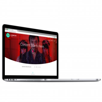
| DESIGN NAME: Symmetry Media PRIMARY FUNCTION: Website INSPIRATION: We took inspiration from the word 'symmetry' pairing eye catching headlines, vibrant colours and emotive animations with clean lines, neutral backgrounds and advanced functionality to create an authentic balance between premium sophistication and creativity. UNIQUE PROPERTIES / PROJECT DESCRIPTION: The website is designed to position the company as a dynamic, film and production company - particularly appealing to creative agency partners. To achieve this goal, we focused on communicating the philosophy of the brand through a series of interactive animations on the homepage, allowing a user to become immersed and inspired by the brand's ethos. We teamed this approach with intuitive functionality and a seamless UX so that we also positioned the brand as switched on professionals. OPERATION / FLOW / INTERACTION: We have used several pieces of advanced javascript to make spending time on the site as intuitive and enjoyable as possible. Including features such as, automatically pausing videos when another is played so a user can move on easily, transitioning the main showreel into the fixed navigation as a user scrolls down so they can return to it at any time to allowing a user to scroll or click through the homepage animations at their own speed - skipping forward or moving on to the work showcase at any time. PROJECT DURATION AND LOCATION: August 2016 Sydney - September 2016 Sydney |
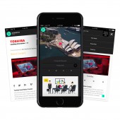
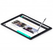
PRODUCTION / REALIZATION TECHNOLOGY: The website is built on a Wordpress platform SPECIFICATIONS / TECHNICAL PROPERTIES: The website is a responsive design, automatically resizing across all browsers and devices. Taking the client's audience and the advanced javascript we have used into account we focused on browsers Chrome, Safari, Firefox, Opera, Microsoft 11 & Edge, iOs and android TAGS: media, symmetry, film, content, Sydney, digital, experience, website RESEARCH ABSTRACT: Before beginning the design process we held a brand session with the client to pull out the necessary information we needed from them in terms of audience perception, TOV, audience segments, business goals and points of difference. We spent time looking at the latest functionality, competitor websites and the client's target agencies to develop something that would appeal to them. CHALLENGE: The biggest challenge when building the site was including a corporate showcase, without deterring new creative clients and allowing the client the necessary freedom to add to the site in the future. To overcome these obstacles, we added a secret button to the fixed navigation on the creative work page that allows a user to see the corporate showcase - we used a clever transition between the pages so it looks like the pages are being 'switched' instead of reloaded by simply switching the background colour from light to dark. The functionality ensures creative clients aren't deterred and the company can still advertise their corporate work. The content management system allows the team to control the order they display their work in and also hide sections of the case study page or add sections such as a testimonial, additional videos and text as their projects grow in size. ADDED DATE: 2016-09-28 07:22:53 TEAM MEMBERS (2) : Jeff Ginsburg and Samantha Cordingley IMAGE CREDITS: Cord & Berg, 2016. |
||||
| Visit the following page to learn more: http://www.symmetrymedia.com/ | |||||
| AWARD DETAILS | |
 |
Symmetry Media Website by Cord & Berg is Winner in Website and Web Design Category, 2016 - 2017.· Read the interview with designer Cord & Berg for design Symmetry Media here.· Press Members: Login or Register to request an exclusive interview with Cord & Berg. · Click here to register inorder to view the profile and other works by Cord & Berg. |
| SOCIAL |
| + Add to Likes / Favorites | Send to My Email | Comment | Testimonials | View Press-Release | Press Kit |
Did you like Cord & Berg's Web Design?
You will most likely enjoy other award winning web design as well.
Click here to view more Award Winning Web Design.


