Layang Layang Making an unforgettable face by Jimmy Yung |
Home > Winners > #50094 |
 |
|
||||
| DESIGN DETAILS | |||||
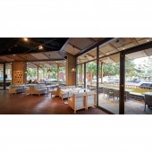
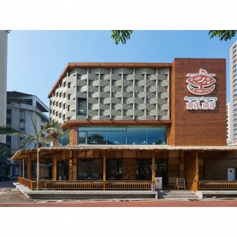
| DESIGN NAME: Layang Layang PRIMARY FUNCTION: Making an unforgettable face INSPIRATION: Based on the shape of the site and the style of the restaurant, the designer stated three solutions:1.Interior UNIQUE PROPERTIES / PROJECT DESCRIPTION: Calligraphy Greenway is an art way in Taichung. On the greenway there are attractions like the National Museum of Natural Science, National Museum of Fine Arts and boutique stores. It is an urban space that deeply connects with the citizens. The case site is shaped in a narrow triangle space right beside Calligraphy Greenway, and the owner is planning on starting a Malaysian-style restaurant named Layang, Layang. OPERATION / FLOW / INTERACTION: In order to extend the interior to the exterior and create a strong connection between the restaurant and the Greenway, the designer planned the outdoor seats and built the eaves above them. People who eat here can enjoy dining nearby these green pathways. Also, the glass windows of the ground floor and the second floor made the restaurant embrace the foliage and surrounding environment. PROJECT DURATION AND LOCATION: The project started in May 2015 in Taichung and finished in August 2015. FITS BEST INTO CATEGORY: Interior Space and Exhibition Design |
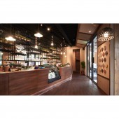
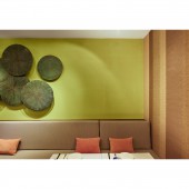
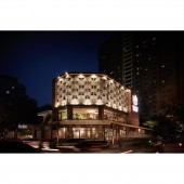
PRODUCTION / REALIZATION TECHNOLOGY: Considering making a protruding facade and keeping kitchen away from the sun, the designer used flooring material to create these woven walls. Inside the restaurant, the steel pillars are covered by a woven straw skin providing a great support for the building. With the wooden walls, floors and furniture, the yellow lamplight composes a cozy vibe for dining. SPECIFICATIONS / TECHNICAL PROPERTIES: The ground floor contains an outdoor sheltered dining area which is about 140 square meters. The indoor dining areas are located on the ground floor and the second floor. Each of them is about 88 square meters and has comfortable seats. The third floor is used solely for the kitchen and is about 83 square meters. By placing a bar right next to the entrance, it enables greater hospitality for customers. TAGS: Weaving, Knitting, Malaysian style, Natural tone RESEARCH ABSTRACT: By creating the semi-outdoor space of the restaurant, barriers can be broken between the restaurant, the city, and people who are in living near this area. To open a part of the restaurant for semi-outdoor dining not only generates more seats for more people but also integrates the restaurant even more with the area to let an intimate relationship with this Greenway area develop. In this way, people would be much more willing to take a seat and have a meal here. CHALLENGE: For the Malaysian restaurant, the designer tried to discover the key elements of Malaysian cuisine and Malaysian culture so he could visualize them into the interior and exterior concepts. Malaysian food is often made with different spices such as serai (lemon grass), pandan (screwpine), kemangi (a type of basil), and bunga kantan (wild ginger buds). They imbibe special flavors to Malaysian food and also give an earth tone color to it. On the other hand, the designer discovered that the art of mat weaving plays an important role in Malaysian culture. Mat-weaving then became the theme of this restaurant and the color of the spices became dictated the main color tone of the design. To create a vivid but cozy vibe in the restaurant, the designer chose similar colors,for examples, deep pastel, red or turmeric yellow to coordinate the interior design. Also, he used a special material to wave an outstanding cover of the building. To overcome the structural deficiencies of the building in the design phase, the designer employed techniques drawn from the art of mat weaving in Malaysia giving added bonus of creating a beautiful visual statement. ADDED DATE: 2016-09-02 10:10:24 TEAM MEMBERS (2) : Designer Jimmy Yung and Team member: Tina Liao IMAGE CREDITS: Image #1: Photographer Hey!Cheese, 2015,Image #2: Photographer Hey!Cheese, 2015,Image #3: Photographer Hey!Cheese, 2015,Image #4: Photographer Hey!Cheese, 2015,Image #5: Photographer Hey!Cheese, 2015 PATENTS/COPYRIGHTS: Copyrights belong to Hey!Cheese and Happystudio,2015 |
||||
| Visit the following page to learn more: http://happystudio.com.tw/#/detail//62/ | |||||
| AWARD DETAILS | |
 |
Layang Layang Making An Unforgettable Face by Jimmy Yung is Winner in Interior Space and Exhibition Design Category, 2016 - 2017.· Read the interview with designer Jimmy Yung for design Layang Layang here.· Press Members: Login or Register to request an exclusive interview with Jimmy Yung. · Click here to register inorder to view the profile and other works by Jimmy Yung. |
| SOCIAL |
| + Add to Likes / Favorites | Send to My Email | Comment | Testimonials | View Press-Release | Press Kit |
| COMMENTS | ||||||||
|
||||||||
Did you like Jimmy Yung's Interior Design?
You will most likely enjoy other award winning interior design as well.
Click here to view more Award Winning Interior Design.


