Freaktion Craft Beer by Allan Suleiman and Breno Frias |
Home > Winners > #49155 |
 |
|
||||
| DESIGN DETAILS | |||||
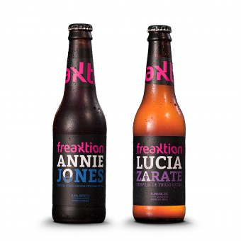
| DESIGN NAME: Freaktion PRIMARY FUNCTION: Craft Beer INSPIRATION: In a market of craft beers booming, which is the best niche to be working? How to differentiate in such a competitive environment? What is the right name? And what about communication? The brand was created to be irreverent, plenty with humor, modern, willing to lift people out of their comfort zone, beginning by the name, Freaktion, and following by deconstructed visual identity and its communication. UNIQUE PROPERTIES / PROJECT DESCRIPTION: Competitive analysis, consumer, market trends, public habits and more liters of information allowed the designers to build territories positioning and marking where each competitor worked for detect an empty space of action. Freaktion was born from freak and friction. A brand that represents authenticity and modernization. The logo brings friction through the typography and at the same time amplifies its youthfulness through vibrant colors. The visual universe is predominantly typographic, in dark colors that strengthen an unique positioning of the brand. OPERATION / FLOW / INTERACTION: Because of all the brand positioning, name, visual identity and developed communication, public interest was seen instantly on social networks, even before the product exists. Many have wanted to know where to find and buy the bottles. Therefore many positive feedbacks regarding the layout were also received. Especially from women, who felt the design just gorgeous. PROJECT DURATION AND LOCATION: The Project Started in March 2015, in Sao Paulo, Brazil, and right after the creation of the Strategy, Positioning, Naming, Branding, Visual Identity, Website and a lot more materials, the beers were already in the market followed by other marketing materials a social media buzz. FITS BEST INTO CATEGORY: Food, Beverage and Culinary Arts Design |
PRODUCTION / REALIZATION TECHNOLOGY: The labels of the beers are printed in a special silver paper, where all colors, except by white and black, are in holographic, differing more from labels out there. SPECIFICATIONS / TECHNICAL PROPERTIES: The visual identity colours exist in RGB and CMYK color profiles. Institutional colors of main pallete are: Magenta (#ec008b; R 236 G 0 B 139, C 0 M 100 Y 0 K 0, Pantone P Process Magenta U), Black (#231f20, R 0 G 0 B 0, C 0 M 0 Y 0 K 100, Pantone P Process Black U), Dark Grey (#221f1f, R 64 G 64 B 65, C 0 M 0 Y 0 K 90, Pantone P 179-14 U) TAGS: beer, craft, design, branding, naming, logo, label, freak, freaktion, annie jones, lucia zarate, ipa, weiss RESEARCH ABSTRACT: In the fight for growth audience, market analysis context appoints that brands sought to bring emotional arguments in their positioning. With the market commoditization beers, the taste of Brazilian was very similar. In this scenario, the big breweries, with similar products were seeking for differentiation in the emotional appeal of the brand. Besides, consumers in the Country are nowadays more and more demanding and critical. Proof of this is the growth of craft beers, linked to superior product quality. Drink less and drink better! A brazilian mainstream brand, for instance, is in a search for differentiation using even more gourmet ingredients and another one is expanding the options through big events and new products. Giving that, the arrival of Craft Breweries as new players is more than welcome in order to renew the options and bring freedom of choice to what you want to drink. It is a booming market! A curiosity is that in Brazil there is no legal definition for a craft microbrewery, but among people, there is some consensus. Consumers come to appreciate and drink because they enjoy it, and not just to socialize with friend. With this, it was created a psychographic profiles called Classy Moderns that defined its main features to plot with the brand positioning chart. CHALLENGE: Unlike the mainstream big brands, the craft has very unique products, working in functional areas. This factor influences a lot in their positions. They have real positioning because they are supported by rational attributes. And here comes a good way to seek differentiation in this market, bringing a brand DNA with factors that generate tension. The tension makes people, stories and most interesting and amazing brands. This tension results in a more engaged and passionate consumers. However, there is no tension when a brand has only rational position. The challenge then was to create a brand that represents authenticity and modernization at the same time, bringing a classic aspiration of an extremely premium and gourmet products. In addition to attributes that create tension between the emotional speech and the product. ADDED DATE: 2016-06-25 15:26:51 TEAM MEMBERS (2) : Allan Suleiman and Breno Frias IMAGE CREDITS: Image #1 Photographer Diego Rinaldi Mendes, Bottles, 2016. Image #2 Photographer Diego Rinaldi Mendes, Street, 2016. Image #3 Photographer Diego Rinaldi Mendes, Glasses, 2016. Image #4 Photographer Diego Rinaldi Mendes, Team, 2016, Apple Press Release Image #5 Illustrator Guilherme Grandiziolli Martins Lopes, Annie, 2016. |
||||
| Visit the following page to learn more: http://freaktion.com.br/ | |||||
| AWARD DETAILS | |
 |
Freaktion Craft Beer by Allan Suleiman and Breno Frias is Winner in Food, Beverage and Culinary Arts Design Category, 2016 - 2017.· Read the interview with designer Allan Suleiman and Breno Frias for design Freaktion here.· Press Members: Login or Register to request an exclusive interview with Allan Suleiman and Breno Frias. · Click here to register inorder to view the profile and other works by Allan Suleiman and Breno Frias. |
| SOCIAL |
| + Add to Likes / Favorites | Send to My Email | Comment | Testimonials | View Press-Release | Press Kit |
Did you like Allan Suleiman and Breno Frias' Culinary Art Design?
You will most likely enjoy other award winning culinary art design as well.
Click here to view more Award Winning Culinary Art Design.


