Svalbardi Polar Iceberg Water by Studio h |
Home > Winners > #47483 |
 |
|
||||
| DESIGN DETAILS | |||||
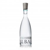
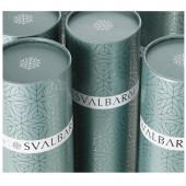
| DESIGN NAME: Svalbardi PRIMARY FUNCTION: Polar Iceberg Water INSPIRATION: We wanted to capture the mood and beautiful stillness of the polar landscape avoiding the use of clichéd images of icebergs and arctic scenes. The simple coloured neck band echoes the blue and green hues found in icebergs and the wooden cap was inspired by arctic driftwood. The ice crystal works alone as a motif and comes to life as a repeat pattern on the gift tube and all collateral. An ancient regional accent is used on the d in Svalbardi as another clue to its Nordic origins. UNIQUE PROPERTIES / PROJECT DESCRIPTION: Svalbardi is harvested from pristine icebergs freshly calved off glaciers in remote Svalbard archipelago. The water is so pure it is almost mineral free. With a restricted production budget, the design had to convey this unique source and purity of the water. Keeping the graphics to the minimum is unusual and allows the bottle and water to evoke the stillness and purity. The gift tube is also unusual in the water market and singles out Svalbardi as a unique purchase. OPERATION / FLOW / INTERACTION: The gentle flaring of the bottle neck creates a perfectly balanced grip for pouring. PROJECT DURATION AND LOCATION: The project started in April 2014 in London and was finished in September 2015. FITS BEST INTO CATEGORY: Packaging Design |
PRODUCTION / REALIZATION TECHNOLOGY: Glass bottle with screen printing and textured paper label with black foil blocking. Sustainable stained wooden cap with inlaid foil silver. The cardboard tube is flat metallic with cold foil on top. SPECIFICATIONS / TECHNICAL PROPERTIES: Bottle size: 320mm H x 90mm D Gift tube: 345mmH x 100mm D TAGS: bottle design, iceberg water design, water packaging design, brand design, Svalbardi packaging design RESEARCH ABSTRACT: The ancient spelling of Svalbardi, meaning cold coasts and named by ancient seafarers, was researched and found to be spelt with an ancient regional accent on the d. This accent was used in the brandmark. Local communities, arctic landscapes and references to ancient explorers discovering the cold coasts were all researched to help provide inspiration for the bottle and lid shape and the graphics. CHALLENGE: The challenge of the bottle design was ensuring the flared neck was strong enough to be held whilst remaining elegant. ADDED DATE: 2016-02-29 19:42:54 TEAM MEMBERS (1) : Designer: Rob Hall IMAGE CREDITS: Studio h, 2015. PATENTS/COPYRIGHTS: Copyrights belong to Svalbardi AS, 2016 |
||||
| Visit the following page to learn more: http://studioh.co.uk | |||||
| AWARD DETAILS | |
 |
Svalbardi Polar Iceberg Water by Studio H is Winner in Packaging Design Category, 2015 - 2016.· Read the interview with designer Studio h for design Svalbardi here.· Press Members: Login or Register to request an exclusive interview with Studio h. · Click here to register inorder to view the profile and other works by Studio h. |
| SOCIAL |
| + Add to Likes / Favorites | Send to My Email | Comment | Testimonials | View Press-Release | Press Kit |
Did you like Studio H's Packaging Design?
You will most likely enjoy other award winning packaging design as well.
Click here to view more Award Winning Packaging Design.


