Fallo protetto! Condom by Rossetti Brand Design |
Home > Winners > #46077 |
 |
|
||||
| DESIGN DETAILS | |||||
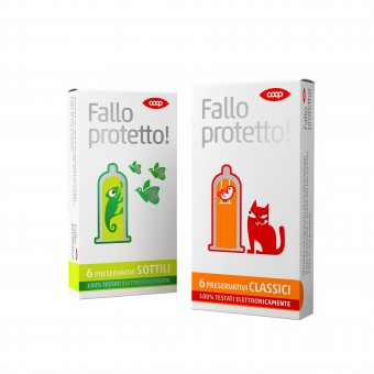
| DESIGN NAME: Fallo protetto! PRIMARY FUNCTION: Condom INSPIRATION: The name is therefore an exhortation to do one of the things that make the world go round with special attention to the protection, respect of themselves and others. The design is complemented by symbolic representations of a protected bird in a cage-condom and a chameleon isolated in a test tube-condom. UNIQUE PROPERTIES / PROJECT DESCRIPTION: Fallo protetto! is the name that we have created for Coop condoms. It is a name that plays on a double meaning : Fallo it as a noun (from the Latin phallus, the male organ erect) and Fallo as the verb do. OPERATION / FLOW / INTERACTION: - PROJECT DURATION AND LOCATION: The project and finalization duration took 2 months FITS BEST INTO CATEGORY: Packaging Design |
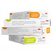
PRODUCTION / REALIZATION TECHNOLOGY: Fallo Protetto! boxes are printed with 3 special colors on white cardboard SPECIFICATIONS / TECHNICAL PROPERTIES: Fallo Protetto! is avaiable in 65 x 120 x 20 mm normal size box and 65 x 120 x 35 mm big size box TAGS: Fallo Protetto!, Condom, Coop, Rossetti Brand Design RESEARCH ABSTRACT: Protection was the key driver of this product/project. We started investigating which styles and ideas were adopted by competitors since that time. Research has been made mainly through internet. CHALLENGE: We choose to stress the idea of protection with simple but iconic drawings avoiding category colors and patterns. As the warning was clear, we decided to say directly: make sex but protect yourself and your partner ADDED DATE: 2016-02-23 15:30:05 TEAM MEMBERS (4) : Creative director: Paolo Rossetti, Copywriter/naming: Paolo Rossetti, Coop Italia, Senior packaging designer: Carlo Bonfanti and 3D specialist: Luca Uliana, Marco Gottardo IMAGE CREDITS: Illustrato Marcella Peluffo |
||||
| Visit the following page to learn more: https://www.rossettidesign.it | |||||
| CLIENT/STUDIO/BRAND DETAILS | |
 |
NAME: Coop Italia PROFILE: With over 150 years of history, Coop Italia is Italy’s biggest cooperative retail chain for the sale of fast moving consumer goods |
| AWARD DETAILS | |
 |
Fallo Protetto! Condom by Rossetti Brand Design is Winner in Packaging Design Category, 2015 - 2016.· Read the interview with designer Rossetti Brand Design for design Fallo protetto! here.· Press Members: Login or Register to request an exclusive interview with Rossetti Brand Design. · Click here to register inorder to view the profile and other works by Rossetti Brand Design. |
| SOCIAL |
| + Add to Likes / Favorites | Send to My Email | Comment | Testimonials | View Press-Release | Press Kit |
Did you like Rossetti Brand Design's Packaging Design?
You will most likely enjoy other award winning packaging design as well.
Click here to view more Award Winning Packaging Design.


