Illusion - Full-Screen Redesign Website by Adriana de Barros |
Home > Winners > #45158 |
 |
|
||||
| DESIGN DETAILS | |||||
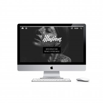
| DESIGN NAME: Illusion - Full-Screen Redesign PRIMARY FUNCTION: Website INSPIRATION: We wanted to make the website photographic and transparent looking, without a navigation section at top that divides itself from the main content. Some of the inspirations were based on print magazine layouts. For example the logo of a print magazine is displayed on the cover and not on every single page, and we thought that this could be possible to do online without losing the identity of the website. UNIQUE PROPERTIES / PROJECT DESCRIPTION: Illusion is an online magazine. The website focused on using large images to present the various artists' works in a gallery format. Always keeping in mind that "less is more," we removed a lot of unnecessary stuff in the sidebar, navigation, article page and footer, making the site even more simple than before. Which works well considering that the site has a lot of content, and we want users to focus on finding the article they're interested in. OPERATION / FLOW / INTERACTION: Improving the previous site design, keeping what worked and taking out what didn't. Essentially keeping it simple and easy to use. PROJECT DURATION AND LOCATION: Site Development from April 2015 to January 2015. |
PRODUCTION / REALIZATION TECHNOLOGY: 14 template pages (each with 9 screen size versions from 320px to over 2600px). Over 125 files were created via Photoshop. Then programming, starting from scratch with CSS3 and HTML5 code for this full-screen site. Also including Javascript and PHP. The navigation has color detection so it will adapt based on whatever image it overlays. And we used HTML5 video for the home page. There were some technical changes trying to get this all to work effectively for a magazine site. When building a site and trying to advance with new elements, it is sometimes difficult to find immediate solutions when not a lot exist at the time. So we tried to push forward with web technologies to create something different. SPECIFICATIONS / TECHNICAL PROPERTIES: A responsive design that works well on mobile devices, tablet, desktop. Even on very large resolution screens. TAGS: website, illusion, magazine, art, film, tattoo, responsive design, responsive, redesign RESEARCH ABSTRACT: We also influenced on the future of computer technology, how we are more connected to computer screens/technologica CHALLENGE: One of the hardest parts was defining which icons to use for the navigation, resuming to 4 or 5 icons that would be the full navigation of site. If to proceed with an extreme change with just one icon button, or if to make a gradual transition to having a few buttons and with time maybe reduce the number depending on the tendency of the Internet. We choose the latter. Sometimes reaching too far in terms of innovation may lead to abstract and confusing results for users. Our goal has been to make the right site for the right moment in time, one that is easy to use and aesthetically pleasing. ADDED DATE: 2016-02-14 20:46:12 TEAM MEMBERS (2) : Designer, Programmer, Project Manager: Adriana de Barros and CSS3 and HTML5 programmer: Vasiliy S. IMAGE CREDITS: Designer, Programmer, Project Manager: Adriana de Barros Programmer (HTML5 and CSS3): Vasiliy S. Website design layout, icons, logotype are copyright of Scene360. All rights reserved. All thumbnails displaying artists' work © respective artists/owners. PATENTS/COPYRIGHTS: Website design layout, icons, logotype are © of Scene360. All rights reserved. All artwork thumbnails © respective artists/owners. |
||||
| Visit the following page to learn more: http://illusion.scene360.com/ | |||||
| AWARD DETAILS | |
 |
Illusion-Full-Screen Redesign Website by Adriana De Barros is Winner in Website and Web Design Category, 2015 - 2016.· Read the interview with designer Adriana de Barros for design Illusion - Full-Screen Redesign here.· Press Members: Login or Register to request an exclusive interview with Adriana de Barros. · Click here to register inorder to view the profile and other works by Adriana de Barros. |
| SOCIAL |
| + Add to Likes / Favorites | Send to My Email | Comment | Testimonials | View Press-Release | Press Kit |
Did you like Adriana De Barros' Web Design?
You will most likely enjoy other award winning web design as well.
Click here to view more Award Winning Web Design.

