
|
|
| DESIGN DETAILS |
DESIGN NAME:
Bare Cosmetics
PRIMARY FUNCTION:
Cosmetic
INSPIRATION:
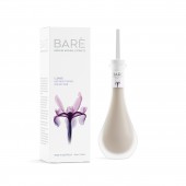
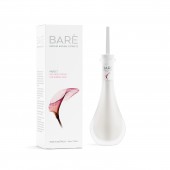
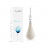
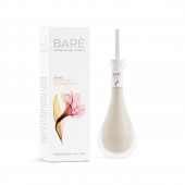
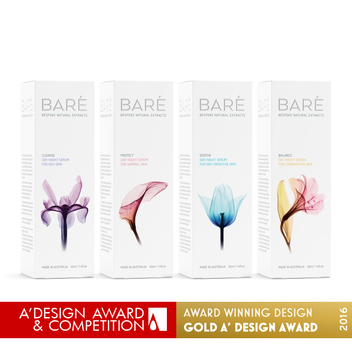
As the product is made from natural botanical extracts it made sense to look at nature for both inspiration and direction. The packaging's visual language and form design represent nature at its very best. The design solution was to reflect natures inner workings in a very transparent and vivid way. This is captured through material usage, the frosted glass bottle, the leaf shaped dropper and the brilliant radiographic images.
UNIQUE PROPERTIES / PROJECT DESCRIPTION:
The project was to create a unique range of bespoke botanical facial serums focusing on adding emotional equity and preciousness, communicating the source of origin and delivering a premium positioning. The solution created a strong point of difference and an own-able asset with the iconic bottle form and new delivery system.
OPERATION / FLOW / INTERACTION:
The unique leaf shaped dropper has a series of fine ridges at the bottom to ensure that when the dropper is removed the serum will not rush in to the hand bit instead drop in to the palm in a slow and controlled fashion.
PROJECT DURATION AND LOCATION:
The project was started in October 2014 and was completed in December 2015.
FITS BEST INTO CATEGORY:
Packaging Design
|
PRODUCTION / REALIZATION TECHNOLOGY:
The bottle is sandblasted clear glass with an injection molded plastic applicator. The neck label is self adhesive printed CMYK, plus two spot colours, hot foil stamped with an all-over satin varnish. The carton uses Heaven 42 for its high-white property, providing a pure background for the luminous images. Their depth and detail achieved using stochastic screening. Hot foil stamping and a subtle satin all-over varnish provide the final touches.
To enhance the unpacking experience, the carton employs clever internal mechanics allowing the bottle to rise when the box is opened.
SPECIFICATIONS / TECHNICAL PROPERTIES:
The box is: 52mm x 52mm 163mm
The bottle is: 50mm x 161mm
TAGS:
Baré, Cosmetic, Beauty product, Face serum, Natural botanicals, Bespoke natural extract, Botanicalss
RESEARCH ABSTRACT:
The project was a fusion of classic skin care and traditional botanics. Exploring and researching a number of material attributes and finishing techniques to develop a new category language for the dropper and create an own-able asset in the bottle. Inside, a slim bookmark style card with box graphics, detailing the key botanicals and a quote from the radiograph artist.
CHALLENGE:
The production of any project is a challenge and this project was no exception. The most challenging was managing the off-shore bottle production to ensure that the quality and consistency was met. This involved providing more detailed drawings, more prototypes and more conversations!
ADDED DATE:
2016-01-07 05:41:15
TEAM MEMBERS (7) :
Designer/Creative Director: Angela Spindler, Industrial Designer: Andrew Simpson, Industrial Designer: Charlie Payne, Cardboard Engineer/Designer: Sarish Shashidhar, Photographer: Steven N Meyers, Label Printer: Impresstik and Box Printer: Hannapak
IMAGE CREDITS:
Image #1: Baré Bespoke Natural Extracts by Angela Spindler, Depot Creative
Image #2: Baré Bespoke Natural Extracts by Angela Spindler, Depot Creative
Image #3: Baré Bespoke Natural Extracts by Angela Spindler, Depot Creative
Image #4: Baré Bespoke Natural Extracts by Angela Spindler, Depot Creative
Image #5: Baré Bespoke Natural Extracts by Angela Spindler, Depot Creative
|
|
| COMMENTS |
| Giulia Esposito |
Comment #2866 on December 25, 2022, 3:23 am |
|
I am absolutely amazed by this "Bare Cosmetics" packaging design! It is a great example of modern minimalism and the way it uses different color gradients to create a stunning effect is truly remarkable. It is clear that a lot of thought and care has gone into this design and it really stands out from the crowd. It is a perfect example of how design can really make a product shine. Great job!
This work was created by Angela Spindler, Depot Creative.
|
| Thomas Anderson |
Comment #20837 on January 3, 2023, 6:32 am |
|
The design of Bare Cosmetics is truly stunning. The packaging design is an incredibly clever representation of nature and its inner workings, with the frosted glass bottle, leaf-shaped dropper, and radiographic images working in perfect harmony. It is also clear that a lot of thought has gone into creating an emotional connection with the consumer, as well as a premium positioning. This is a truly unique, beautiful and premium product, and it is thoroughly deserving of the A' Design Award.
|
| Victoria Hill |
Comment #21127 on January 3, 2023, 6:37 am |
|
Bare Cosmetics is an awe-inspiring product that truly sets a new standard for packaging design. Its design fuses classic skin care and traditional botanics, with a unique range of bespoke botanical facial serums. The iconic bottle form and new delivery system creates a strong point of difference and an own-able asset. The visual language and form design of the packaging reflects nature at its very best, and this is captured through the material usage, the frosted glass bottle, the leaf shaped dropper and the brilliant radiographic images. The production of the product was a challenge, however the meticulous attention to detail and quality has paid off, with a truly remarkable end result.
|
| Valentina Rossi |
Comment #23935 on January 3, 2023, 7:31 am |
|
This award-winning work is an excellent example of how creative design can be used to craft an own-able asset with a strong point of difference. The combination of classic skin care and traditional botanicals, coupled with the use of clever internal mechanics, provide an impressive unpacking experience.
|
| Paul Williams |
Comment #26390 on January 3, 2023, 8:19 am |
|
The design of Bare Cosmetics is simply awe-inspiring! The iconic bottle form, the new delivery system, and the source of origin are all captured in the beautiful design. The use of natural botanical extracts is reflected in the visual language and form design, giving an emotional equity and preciousness to the product. The production of the project was managed masterfully, ensuring the quality and consistency was met. The attention to detail is evident in the frosted glass bottle, the leaf shaped dropper, the brilliant radiographic images, and the clever internal mechanics of the carton. All of these elements combined make this design truly unique and worthy of the A' Packaging Design Award!
|
| Patricia Miller |
Comment #26570 on January 3, 2023, 8:23 am |
|
Angela Spindler, Depot Creative's award-winning work "Bare Cosmetics" is an eye-catching example of truly exceptional packaging design, employing clever materials and techniques to create an unforgettable unpacking experience.
|
| Paul Phillips |
Comment #29595 on January 3, 2023, 9:21 am |
|
The Bare Cosmetics packaging design is simply amazing. It really captures the essence of the product and its source of origin, while delivering an incredibly premium feel. The iconic bottle form and new delivery system is incredibly unique, and it stands out from the usual packaging designs in the cosmetic industry. I especially love the way it adds emotional equity and preciousness to the product, and how it elevates the whole user experience. It's no wonder the design was awarded the A' Design Award!
|
| Adam Harris |
Comment #30898 on January 3, 2023, 9:47 am |
|
I am absolutely captivated by Bare Cosmetics and the amazing work of Angela Spindler, Depot Creative! This packaging design is nothing short of stunning with its iconic bottle form and delivery system, evoking a feeling of nature at its very best. The attention to detail that went into the research and production of this project is truly remarkable, creating a strong point of difference and a sense of preciousness. I am so impressed by the design's innovative approach and its ability to capture the essence of botanical extracts. It is easy to see why this work was awarded the A' Design Award for its unique properties and outstanding design. Congratulations on such an amazing accomplishment!
|
| Chloe Turner |
Comment #34164 on January 3, 2023, 10:56 am |
|
What a wonderful and unique take on packaging design! Angela Spindler, Depot Creative has managed to capture the beauty and complexity of nature in a visually stunning way. The frosted glass bottle, leaf shaped dropper and radiographic images all come together to create a package that is not just aesthetically pleasing but also conveys the natural botanical extracts contained within. It is truly a work of art, and a well deserved winner of the A' Design Award.
|
| Elena Petrenko |
Comment #34347 on January 3, 2023, 11:00 am |
|
This award-winning work combines beautiful visual language, creative form design, and innovative material usage to create an eye-catching packaging solution that perfectly reflects the natural botanical origins of the product.
|
| Elisabeth Clark |
Comment #34954 on January 3, 2023, 11:12 am |
|
As a design enthusiast, I am absolutely blown away by Angela Spindler, Depot Creative's Bare Cosmetics project! The attention to detail and thought that has gone into this work is truly remarkable. The iconic bottle shape and the new delivery system are truly unique and eye-catching, while the use of natural botanical extracts to inspire the visuals and form design is simply stunning. I am especially impressed by the material usage and the leaf-shaped dropper, which help to make the product stand out. And the inclusion of the slim booklet with box graphics detailing the key botanicals and a quote from the radiograph artist only adds to the luxurious feel of the product. This work is a great example of good design and I'm very impressed. Kudos to Angela Spindler, Depot Creative for such an amazing work!
|
| Hien Nguyen |
Comment #75003 on January 4, 2023, 5:06 am |
|
I am delighted to learn of Angela Spindler, Depot Creative's success in winning the A' Design Award for their 'Bare Cosmetics' Packaging Design. This achievement is a testament to the exceptional skill and creativity of Angela Spindler, Depot Creative and I extend my sincere admiration for the work.
|
|
|
