Sven's Island Personal care by Angela Spindler |
Home > Winners > #44266 |
 |
|
||||
| DESIGN DETAILS | |||||
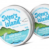
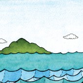
| DESIGN NAME: Sven's Island PRIMARY FUNCTION: Personal care INSPIRATION: We had a great opportunity to make this brand completely different from any of the other natural personal care products in the market. Great Barrier Island is a remote, unspoilt wilderness in the outer Hauraki Gulf and home to both magical Manuka and Kanuka oils. As the uniqueness of the product is its source, the island, this then became the key visual driver for the design solution. UNIQUE PROPERTIES / PROJECT DESCRIPTION: The uniqueness is in the product itself and that the island is the only place in the world where both of these plants exist. We worked with New York artist Danielle Laurenti to create these wonderfully playful images of nature at its best. OPERATION / FLOW / INTERACTION: The product packaging is rigid enough to withstand the products frequent usage and the likely hood of it being thrown in to a bag. The actual state of the product, the creams, are almost solid so again the aluminium material works well for this. The plastic labels were best suited to the products high oil content, therefore avoiding any label staining or degeneration. PROJECT DURATION AND LOCATION: The project started in April 2014 and was finalised in January 2015 FITS BEST INTO CATEGORY: Packaging Design |
PRODUCTION / REALIZATION TECHNOLOGY: We wanted the products to be packaged in tins referencing historically how this type of product was packaged. The labels were printed on a pearlescent plastic self adhesive stock in CMYK with a spot gloss UV varnish. We printed them digitally which gave a great result for the watercolour illustrations, the continuous tone meant even the most delicate of colour was reproduced. In addition, this met the limited budget criteria. SPECIFICATIONS / TECHNICAL PROPERTIES: Hand Guard: 78mm x78mm Barefoot Balsam: 78mm x 78mm Miracle Manuka: 63mm x63mm Lip Balmy: 38mm x 38mm TAGS: Personal care, natural remedies, hand cream, foot balm, lip balm, manuka, kanuka RESEARCH ABSTRACT: Even though the product is of botanical origin, we wanted to show the products naturalness but not in a typical way. We reviewed a number of illustrative styles that would give the brand a fresh and quirky appeal while highlighting the clean and green colour associations of New Zealand. We commissioned a range of wildlife images that could be used across the product range as it grew. The typographic styling for the brand mark needed to be voluptuous and playful befitting of the brand's positioning and appeal. CHALLENGE: The challenge with the project was the budget. This was for a start up and so cost efficiencies were very much part of the design process. This meant being more mindful of production expenses and applying inventive ways of delivering the desired result for all stakeholders. In addition, the brand name changed half way through the project so we had to work hard to retain the approved look and feel and apply it to the new name. ADDED DATE: 2016-01-07 05:30:53 TEAM MEMBERS (2) : Angela Spindler: Creative Director/Designer and Danielle Laurenti: Illustrator IMAGE CREDITS: Image #1: Sven's Island by Angela Spindler, Depot Creative Image #2: Sven's Island by Angela Spindler, Depot Creative Image #3: Sven's Island by Angela Spindler, Depot Creative Image #4: Sven's Island by Angela Spindler, Depot Creative Image #5: Illustration by Danielle Laurenti PATENTS/COPYRIGHTS: TM 2014 Sven's Island, All right reserved. |
||||
| Visit the following page to learn more: http://www.wearedepot.com.au | |||||
| AWARD DETAILS | |
 |
Sven's Island Personal Care by Angela Spindler is Winner in Packaging Design Category, 2015 - 2016.· Read the interview with designer Angela Spindler for design Sven's Island here.· Press Members: Login or Register to request an exclusive interview with Angela Spindler. · Click here to register inorder to view the profile and other works by Angela Spindler. |
| SOCIAL |
| + Add to Likes / Favorites | Send to My Email | Comment | Testimonials | View Press-Release | Press Kit |
| COMMENTS | ||||||||||||||||||||
|
||||||||||||||||||||
Did you like Angela Spindler's Packaging Design?
You will most likely enjoy other award winning packaging design as well.
Click here to view more Award Winning Packaging Design.


