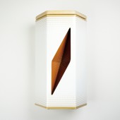
SCW Chocolate Packaging Packaging by Ning Li |
Home > Winners > #44092 |
 |
|
||||
| DESIGN DETAILS | |||||
| DESIGN NAME: SCW Chocolate Packaging PRIMARY FUNCTION: Packaging INSPIRATION: The shape and form were inspired by the Wiener Werkstatte artists of Vienna Secession Movement: Egon Schiele. His was well-known by his drawing style: the distorted and disjointed human body figures. Hence, I borrowed this concept and created the similar style: seemingly unbalanced and distorted shape, but meanwhile, they group in harmony and could nest peacefully in a hexagon shaped box. UNIQUE PROPERTIES / PROJECT DESCRIPTION: Salzburg Chocolate Werks is a special edition that is designed for celebrating the 100th year anniversary. The design brief of this project is to achieve the luxury and elegant chocolate packaging based on our assigned Wiener Werkstatte artists from the Vienna Secession movement. The shape of the chocolate box is inspired by the style from Egon Schiele, whose portrait is known for its disjointed and tortured figure. OPERATION / FLOW / INTERACTION: The three flavor chocolate gift set packaging allows users to select any three chocolate flavors and packaged into the box. The holes of the box gives the audience a confident feeling of the products without unwrapping it and also create a personal identity as it appears the colors differently. The special shape of chocolate packaging can be displayed on shelf straightly and unlimitedly. PROJECT DURATION AND LOCATION: Started in February 2015 and finished in May 2015 in New York City. FITS BEST INTO CATEGORY: Packaging Design |
PRODUCTION / REALIZATION TECHNOLOGY: Basswood was used for lid and structure bases, and was wrapped by papers. The primary packaging was folded through one piece of paper, and then applied the gold foil stamped and embossed. SPECIFICATIONS / TECHNICAL PROPERTIES: Primary Packaging: 1.5in x 1.5in x 6in; Secondary Packaging: 1.9in x 1.9in x 6.5in. TAGS: chocolate, shape, hexagon, gift set, artistic, packaging, unique, handmade, classic RESEARCH ABSTRACT: After researched the current chocolate markets and packaging designs, I found out that chocolate is an inspiring food for many creative projects, many packagings were hence focused on this idea and endeavored on designing the wrap's graphics. However, the chocolate packaging should also inspire users in a more crazy way by its distinct form and shape that created an opportunity for my design. CHALLENGE: I want to create an odd but balanced shape packaging as a representative of the Egon Schiele style. But it was hard to develop such distorted shape and form as they usually couldn't stand up steadily or be folded through one piece of paper. So I started with a single shape: hexagon, and subtly carved the surface to create the packaging form. The outcomes surprised me that the function of the packagings can be displayed in multiple ways, which is a benefit for gift set packaging. ADDED DATE: 2015-12-17 20:38:02 TEAM MEMBERS (1) : Instructor: Thomas Delaney IMAGE CREDITS: All images: Ning Li |
||||
| Visit the following page to learn more: http://ningli.prosite.com/ | |||||
| AWARD DETAILS | |
 |
Scw Chocolate Packaging Packaging by Ning Li is Winner in Packaging Design Category, 2015 - 2016.· Read the interview with designer Ning Li for design SCW Chocolate Packaging here.· Press Members: Login or Register to request an exclusive interview with Ning Li. · Click here to register inorder to view the profile and other works by Ning Li. |
| SOCIAL |
| + Add to Likes / Favorites | Send to My Email | Comment | Testimonials | View Press-Release | Press Kit |
Did you like Ning Li's Packaging Design?
You will most likely enjoy other award winning packaging design as well.
Click here to view more Award Winning Packaging Design.


