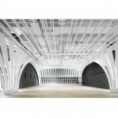
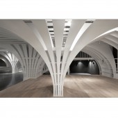
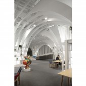
Toby’s Home Interior by Chris Precht |
Home > Winners > #44049 |
| CLIENT/STUDIO/BRAND DETAILS | |
 |
NAME: penda PROFILE: Penda is a fresh and motivated team of international creatives based in Beijing and Vienna. In 2013, Chris Precht and Dayong Sun founded Penda in the belief that architecture can serve as a bridge connecting nature, culture and people to a higher standard of living. By drawing different perspectives from western and eastern history, Penda seeks the fundamentals in architecture and interprets them, integrating them into one cross-cultural design-language. Therefore, we are interested in the questions of how life has evolved throughout history, what has influenced this evolution, and how architecture can add our quality of life in the future. We love what we do, and are truly passionate about architecture & design, developing every project with uttermost dedication. |
| AWARD DETAILS | |
 |
Toby’s Home Interior by Chris Precht is Winner in Interior Space and Exhibition Design Category, 2015 - 2016.· Read the interview with designer Chris Precht for design Toby’s Home here.· Press Members: Login or Register to request an exclusive interview with Chris Precht. · Click here to register inorder to view the profile and other works by Chris Precht. |
| SOCIAL |
| + Add to Likes / Favorites | Send to My Email | Comment | Testimonials | View Press-Release | Press Kit |
Did you like Chris Precht's Interior Design?
You will most likely enjoy other award winning interior design as well.
Click here to view more Award Winning Interior Design.


