Georg Jensen Munich Retail Store by Studio David Thulstrup |
Home > Winners > #43740 |
 |
|
||||
| DESIGN DETAILS | |||||
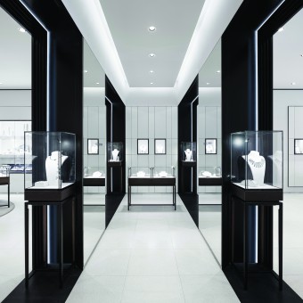
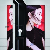
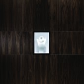
| DESIGN NAME: Georg Jensen Munich PRIMARY FUNCTION: Retail Store INSPIRATION: The store concept is inspired by geometric, Scandinavian and Art Deco references, all stemming from the Danish silversmith's Georg Jensen's rich brand history. The use of rough hammered terrazzo is a reference to the art of silversmithing and the technique of hammered silver. UNIQUE PROPERTIES / PROJECT DESCRIPTION: The gallery-like store showcases Georg Jensen's most prominent pieces of hollowware, jewellery and watches. Each merchandise category has its own defined space and atmosphere, and the customer is led through the store, one space at a time. The jewellery is displayed within a framing of soft textured walls with a geometric line language highlighting the delicate Georg Jensen pieces. OPERATION / FLOW / INTERACTION: When entering the store the customer is welcomed into a bright space with honed terrazzo, black steel and light grey wall surfaces where the jewellery and hollowware belong. Further inside the store, the newly introduced men's area along with the private sales area, offer a warmer atmosphere with walls covered in dark walnut and high vertical timber slats. The natural materials of walnut timber and grey honed terrazzo stand in a warm contrast to the black steel and grey nuanced walls and floor. PROJECT DURATION AND LOCATION: The project development took place in Copenhagen, Denmark and was built on site in Munich, Germany. it was initiated in August 2014 and finished in May 2015 with the store opening. FITS BEST INTO CATEGORY: Interior Space and Exhibition Design |
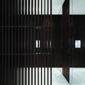
PRODUCTION / REALIZATION TECHNOLOGY: Nextel paint finish was used to create a luxurious effect on the grey wall surfaces. It was was selected to contrast the glossy and reflective surfaces of the products on display. Timber slats feature wall in the private sales area acts as a space divider and provide semi-transparency and some privacy, while still adhering to the clients wish for an inviting space. The framing effect of the Art Deco niches was emphasized through the use of concealed LED strip lighting. SPECIFICATIONS / TECHNICAL PROPERTIES: The floor area is 250 m2. TAGS: Retail interior, Jewellery, Hollowware, Art Deco, Simplicity, Craftsmanship, Terrazzo, Timber slats, Steel, Gallery, RESEARCH ABSTRACT: We researched and analysed the Danish silversmith brand, Georg Jensen along with their old store concept. Furthermore we received a brief from them, with their wishes for a Scandinavian inspired, material rich space where the merchandise would be highlighted in a sophisticated and minimalistic way. It was important for them that the space would represent the brand and it's history. The result was a space inspired by geometric, Scandinavian and Art Deco references. CHALLENGE: Our main challenge when making the new store concept for Georg Jensen was to make a fitting link with the old store concept, while designing a completely new one. It was important to choose the exact right element and portion from the old store concepts DNA to make a smooth transition. We did this by working further with the slats – which also existed in the old concept – and which are a great reference to Scandinavian design as well as to the Art Deco style, both a part of Georg Jensen’s rich brand heritage. ADDED DATE: 2015-11-13 13:07:49 TEAM MEMBERS (6) : David Thulstrup, Thibaut Allgayer, Alana Keogh, Lorenzo Rossi, Georgina Prittie and Anny Wang IMAGE CREDITS: Images #1-5 Hampus Berndtson, Variations, 2015. |
||||
| Visit the following page to learn more: http://bit.ly/1ojyAFq | |||||
| AWARD DETAILS | |
 |
Georg Jensen Munich Retail Store by Studio David Thulstrup is Winner in Interior Space and Exhibition Design Category, 2015 - 2016.· Read the interview with designer Studio David Thulstrup for design Georg Jensen Munich here.· Press Members: Login or Register to request an exclusive interview with Studio David Thulstrup. · Click here to register inorder to view the profile and other works by Studio David Thulstrup. |
| SOCIAL |
| + Add to Likes / Favorites | Send to My Email | Comment | Testimonials | View Press-Release | Press Kit |
Did you like Studio David Thulstrup's Interior Design?
You will most likely enjoy other award winning interior design as well.
Click here to view more Award Winning Interior Design.


