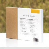
DESIGN NAME:
Raw'iu
PRIMARY FUNCTION:
Frozen Foods
INSPIRATION:
The main inspiration came from a rich Lithuanian nature: colours, shapes, textures. Also, propagating a healthy, ecologic lifestyle.
UNIQUE PROPERTIES / PROJECT DESCRIPTION:
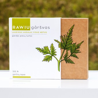
It was reaching for the brand to reveal the centenarian Lithuanian traditions of using wild plants in cookery. This kind of product is being packed into boxes: this is a new, undiscovered item. An exceptional view and suggestion to appreciate more and use treasures of the nature.
OPERATION / FLOW / INTERACTION:
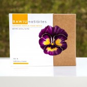
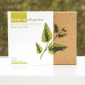
The design of packaging should capture client’s eye. Taking account for that the packaging is being put into freezers. Natural nature colours give an impression of an ecological, healthy product. The illustrations that were created for the project precisely reflect the appearance of the plant and purposely create an image of a product of quality. The information which is on the packaging is given in that way so that the segments would be separated clearly and visually capture the attention to a useful information (for example, vitamins that are in this plant, dishes that they could be used in.)
PROJECT DURATION AND LOCATION:
This concept project started in January 2014 and finished in June 2014.
FITS BEST INTO CATEGORY:
Packaging Design
|
PRODUCTION / REALIZATION TECHNOLOGY:
The packaging was made from cardboard coated paper, covered with Soft Touch laminate.
SPECIFICATIONS / TECHNICAL PROPERTIES:
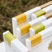
Offset printing and UV printing. Dimensions 141,5mm:120mm:21,5mm; 141mm:119,5mm:21mm; 141,5mm:120mm:16,5mm; 141mm:119,5mm:16mm;.
TAGS:
Natural, ecological, wild plants, traditions
RESEARCH ABSTRACT:
It was important to analyze the particularity of packaging which are in freezers (the shape of packaging, font size). Also a big analysis was given to ecological products (used colours, elements, materials, textures). The analysis was composed together with packaging of food producers, where it was necessary to put attention into texts, slogans, graphic solutions.
CHALLENGE:
One of the biggest challenges was to create a fitting name which would reveal the idea. As well that it would be understandable to wide group of people, but would also suit for international market. Another challenge was the creation of suitable shape of the package. Giving it modernism and making it suitable for shelves of frozen products.
ADDED DATE:
2015-09-30 19:03:46
TEAM MEMBERS (1) :
Project supervisor: Edvardas Kavarskas
IMAGE CREDITS:
Photographer: Greta Gedminaitė, 2015
|


