Less is a bore Interior design, Residential by Anita Huang |
Home > Winners > #43229 |
 |
|
||||
| DESIGN DETAILS | |||||
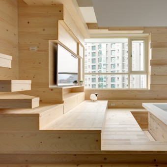
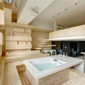
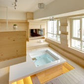
| DESIGN NAME: Less is a bore PRIMARY FUNCTION: Interior design, Residential INSPIRATION: Open island table, transforms dining space to a party and cooking space! The kitchen with white geometric lines and black body in the island area, forming an open regional landmark and visual focus, by conducting the visual continuity with the base, the use of mediums and overlays, to elaborate a sustaining, comfortable and casual lifestyle. Giving the quietness and warmness with a modest style that hidden in the city, natural and full of imagination. UNIQUE PROPERTIES / PROJECT DESCRIPTION: Breaking down the barriers of existing indoor pattern, adopted the view from the aspect of humanities, life individuality, duplex multiple considerations, the design with lines, facade, overlapping, via the solid wood mediums features and expressions, to pay the intimacy of devout attitude to the nature, so that the space is more copious and vibrant. OPERATION / FLOW / INTERACTION: Multiple functional space, bedroom merging with play and reading function!With the limited space and height, the upper floor was adjusted, integrated, and maximized the virtual space, to fuse with aisle and the living space of original construction to complete "Zero Limits" spatial scales. The ceiling was continued with simple and neat wall design, effectively enlarged the space and height, while the wooden texture and warm color expression is in harmony with the outdoor space and the nature. PROJECT DURATION AND LOCATION: May 2015 , Taipei |
PRODUCTION / REALIZATION TECHNOLOGY: The special Jacuzzi bathtub by large window was planned as the theme of the living room, this design would help pressure-release and different from the traditional furniture arrangement. Beams were covered by the solid wood, becoming hidden boundary with storage function. Omitting excessive handling, the original condition of the medium was reserved, conveying the renewal concept of the material, along with the light, external environment echoing the true feelings in harmony with the nature. The design style could treat people and environment more friendly. SPECIFICATIONS / TECHNICAL PROPERTIES: Dimensions: 66 m2 TAGS: sharing, Break the rules, nature, simple casual, comfortable space, interior design RESEARCH ABSTRACT: The solid wood mediums inject simple and unadorned atmosphere, further improving the establishment of facade expression and occult constituent elements, interpreting the taste and personality. Imaging the desired leisure life for the future from the seen scenes. CHALLENGE: Overlaying and piling of fascination, hiding the cupboard within the floor and facade style! Inherited American architect Robert Venturi's proposition "less is a bore", advocating that structure of the building should correspond to the cultural attitude, establishing a new aesthetics and entertainment. ADDED DATE: 2015-09-30 09:44:18 TEAM MEMBERS (2) : Design manager:Huang Ching Hsuan and Designer:Chan Hui Chun IMAGE CREDITS: Image #1-8: Photographer Shiao Yu Min, Less is a bore, 2015. |
||||
| Visit the following page to learn more: http://mushi-id.com/ | |||||
| AWARD DETAILS | |
 |
Less Is a Bore Interior Design, Residential by Anita Huang is Winner in Interior Space and Exhibition Design Category, 2015 - 2016.· Read the interview with designer Anita Huang for design Less is a bore here.· Press Members: Login or Register to request an exclusive interview with Anita Huang. · Click here to register inorder to view the profile and other works by Anita Huang. |
| SOCIAL |
| + Add to Likes / Favorites | Send to My Email | Comment | Testimonials | View Press-Release | Press Kit |
Did you like Anita Huang's Interior Design?
You will most likely enjoy other award winning interior design as well.
Click here to view more Award Winning Interior Design.


