The Ultra Modernism Residential apartment by Eric Tam |
Home > Winners > #43082 |
 |
|
||||
| DESIGN DETAILS | |||||
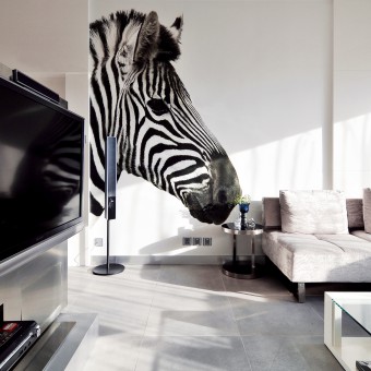
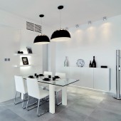
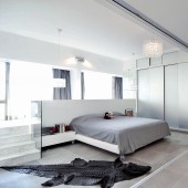
| DESIGN NAME: The Ultra Modernism PRIMARY FUNCTION: Residential apartment INSPIRATION: We developed the primary inspiration which was coming from the nationality of the home owners, who are from France and accustomed to the simple and comfortable life which is completely different from the busy crowded city life in the East Asian Las Vegas. We were looking to build up the mood from some subtle colours, with little decorative items, to accentuate the peaceful personality of the apartment. UNIQUE PROPERTIES / PROJECT DESCRIPTION: As you may see, the white themed decoration and design is to embrace the incomplex and relaxed atmosphere for the living space. Moreover, the use of calming colours and less decorative items naturally emphasises the pleasant home, which makes the apartment simple yet elegant. The master bedroom was rearranged into an open concept with floor to ceiling sliding doors, dividing the bedroom from the hallway. It then advanced the size of the bedroom and it became comparable with the size of the living room, which turned the living room into a spacious dazzling area. Besides, there is a small platform filled with cushions just behind the bed which creates a spot for the couple to relax and rest. They are also able to enjoy the scenery view from the outside. The master bedroom is an en-suite bedroom, with the bathroom located behind the TV stand which is opposite the bed. The idea of disguising the bathroom was initially our idea which was because it introduces a more private and exclusive area of the bedroom. Furthermore, the spare bedroom is transformed into a guest bedroom as well as another platform behind the bed, which allowed the couple to put their mini home office in the guest bedroom. OPERATION / FLOW / INTERACTION: - PROJECT DURATION AND LOCATION: The project started in December 2014 in Macau and finished in October 2015 and it was featured in Modern Home Magazine (Hong Kong) in December 2015. FITS BEST INTO CATEGORY: Interior Space and Exhibition Design |
PRODUCTION / REALIZATION TECHNOLOGY: - SPECIFICATIONS / TECHNICAL PROPERTIES: - TAGS: White, Modernism, Subtle, Simple RESEARCH ABSTRACT: At present, clients look at the designers' experience with their type of project, then at firm's experience. They next evaluate the ability to complete the project on time and within set budget, and the accuracy in making estimates and specifications. Also down the list of their considerations is the kind of design work the firm does, the firm's quality of management, the size of the firm, and the in-house capabilities. We have looked into specific style of design regarding the project, in which case is the ultra-modern western home design, which is fulfilled with sober colours and floor to ceiling windows and glass doors. We looked into the materials being used in this specific style and consulted with our client, who was very satisfied by our choice of materials. We have also showed our client our previous projects which are similar to this project, in terms of rearranging the layout of the apartment, and the ultra-modern theme design. We then rearranged the layout of the apartment according to client's preferences, which is to transform the apartment into a two-bedroom flat instead of a three-bedroom family apartment. Not only does it enlarges the size of the master bedroom, also giving the couple a spare bedroom/study to accomplish their ideal living space. We have evaluated the results of the research part of the project, it has helped us to better understand the needs of our client, the ultra-modern theme design, as well as client's lifestyle and habits. For example, we understand that they prefer having natural sunlight while they are at home, we have built two platforms in the master bedroom and the guest bedroom for that purpose. Not only they are able to enjoy natural sunlight in their bedroom, but also at the study platform in the guest bedroom. Moreover, we also found out that our client prefer neutral coloured furniture, which also corresponds with the main theme of the apartment. CHALLENGE: The most challenging part of this project was the use of toness, as it may show in the provided images, the white, grey and black belong in the same tone family, which interrelate with each other. It was a difficult task to combine them in one space without offering the cold and empty atmosphere. ADDED DATE: 2015-09-29 05:51:50 TEAM MEMBERS (1) : Eric Tam IMAGE CREDITS: Eric Tam, 2015. |
||||
| Visit the following page to learn more: http://www.e-t.com.hk/ | |||||
| AWARD DETAILS | |
 |
The Ultra Modernism Residential Apartment by Eric Tam is Winner in Interior Space and Exhibition Design Category, 2015 - 2016.· Read the interview with designer Eric Tam for design The Ultra Modernism here.· Press Members: Login or Register to request an exclusive interview with Eric Tam. · Click here to register inorder to view the profile and other works by Eric Tam. |
| SOCIAL |
| + Add to Likes / Favorites | Send to My Email | Comment | Testimonials | View Press-Release | Press Kit |
Did you like Eric Tam's Interior Design?
You will most likely enjoy other award winning interior design as well.
Click here to view more Award Winning Interior Design.


