CREAM Irvine Ice Cream Shop by Hootan Hamedani |
Home > Winners > #42012 |
 |
|
||||
| DESIGN DETAILS | |||||
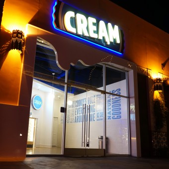
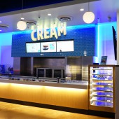
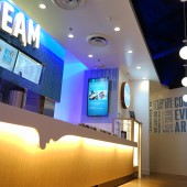
| DESIGN NAME: CREAM Irvine PRIMARY FUNCTION: Ice Cream Shop INSPIRATION: CREAM, the name of the store, is a short, abbreviated form of: Cookie Rules Everything Around Me. This phrase was an inspirational statement that initiated the design of exterior and interior of CREAM. Instead of looking out for creative ideas we looked closely at what we had in the CREAM ice cream store: warm cookies and cold ice-cream. The color, taste and form of these two items are reflected throughout the store. UNIQUE PROPERTIES / PROJECT DESCRIPTION: CREAM is distinct because it was designed to be simple, charming, and happy space. Simple materials, unique lighting and variety of colors were enhanced for this goal. Blue and yellow lighting that is used in CREAM intensifies the playfulness of the shop. Blue, yellow, white, and brown colors of the materials amplifies happy energies. The fact that every form, light, and color in the store is related to cold ice cream and warm cookies makes the design of CREAM even more distinctive. OPERATION / FLOW / INTERACTION: Customers enter the store. They stand in a line where they can choose their ice cream flavor and cookie. while customers are in the line, they can enjoy the happy atmosphere of CREAM and see the design of the store. PROJECT DURATION AND LOCATION: The Project started in January 2015 and finished in June 2015. It is located in Irvine, California, USA. FITS BEST INTO CATEGORY: Interior Space and Exhibition Design |
PRODUCTION / REALIZATION TECHNOLOGY: Simple white surfaces with blue subway tile as a symbol of "CREAM". LED lighting for energy saving and oven exhaust technology to create the smell of cookie for customer's attraction. SPECIFICATIONS / TECHNICAL PROPERTIES: 190 square meter of space with 6 meters width storefront. Simple materials, shiny surfaces and Stainless Steel. Stained concrete floor and open ceiling. TAGS: CREAM, Ice Cream, Lighting, Charming, Simple, Modern, Light Contrast, Dripping RESEARCH ABSTRACT: we studied and tested our construction materials in different lighting effects so we can come up with the best color combination for the store. it was very important for us to use lights and colors that would make CREAM a happy and charming store. CHALLENGE: CREAM was situated in one of the alleys of the shopping center where people barely pass. multiple solutions were implied to make CREAM eye-catching, so people who were passing the main plaza of the shopping center could hardly close their eyes to. The entire storefront of CREAM got rotated to face the main plaza. This rotation helped passers from far away to notice CREAM. Secondly, storefront was completely redesigned. These solutions made CREAM a visible store where passers can hardly resist. ADDED DATE: 2015-06-30 20:52:02 TEAM MEMBERS (3) : Hootan Hamedani, Farzane Sarpoolaki and Ladan Zolfaghari IMAGE CREDITS: Hootan & Associates Design Studio |
||||
| Visit the following page to learn more: http://on.fb.me/1Ht14my | |||||
| AWARD DETAILS | |
 |
Cream Irvine Ice Cream Shop by Hootan Hamedani is Winner in Interior Space and Exhibition Design Category, 2015 - 2016.· Read the interview with designer Hootan Hamedani for design CREAM Irvine here.· Press Members: Login or Register to request an exclusive interview with Hootan Hamedani . · Click here to register inorder to view the profile and other works by Hootan Hamedani . |
| SOCIAL |
| + Add to Likes / Favorites | Send to My Email | Comment | Testimonials | View Press-Release | Press Kit |
Did you like Hootan Hamedani's Interior Design?
You will most likely enjoy other award winning interior design as well.
Click here to view more Award Winning Interior Design.


