PplusP Studio 2 Corporate Design by Wesley Liu |
Home > Winners > #41939 |
 |
|
||||
| DESIGN DETAILS | |||||
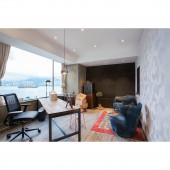
| DESIGN NAME: PplusP Studio 2 PRIMARY FUNCTION: Corporate Design INSPIRATION: Abandoned traditional cubicle office layout, PplusP Designers has adopted a different approach in their office design. With the believe that a creative working environment helps stimulating minds and inspiring innovations, the second studio of PplusP Designers was designed with a mood of modern American factory. Instead of a tedious office that surrounded by white walls and white fluorescent tubes, the ambience of the environment tends to cultivate a homey and nostalgic feeling. Our design director, Wesley Liu laid all the boutique collection as well as his DIY creations. UNIQUE PROPERTIES / PROJECT DESCRIPTION: Walking into this expanded studio, there is a long corridor to invite the guests entering the reception area. Taking off your shoes and change into slippers, this is where the cozy and relaxing atmosphere of home begins. Not to mention at the corner is the hand blown white smoked glass made in Murano, GLÒ Incasso is a piece of art as a lighting element and the matching glass is a hand-poured, free-form glass plate to place below the suspended ‘Drop’ for adding bit of amusement. Getting pass the conference room, you would realize the atmosphere harmonizes the reaction of all your senses. OPERATION / FLOW / INTERACTION: The cork wall insulation brings the deep tone to become dominant in Wesley’s room and integrates well with the teapot pendant light, wooden furniture, denim sofas collection, antique accessories and artwork. Besides, the large window welcomes entering of daylight, which helps avoiding unnecessary use of lighting in daytime and offers panoramic sea view. The wooden window connects this room and the secretariat. Consequently, this favored the communication between Wesley and his secretary in order to be more explicit and efficient at work. PROJECT DURATION AND LOCATION: The project started in February and finished in May 2015 in Hong Kong. FITS BEST INTO CATEGORY: Interior Space and Exhibition Design |
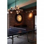
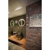
PRODUCTION / REALIZATION TECHNOLOGY: Moving toward the working area, Wesley chisels the Bank of China Tower on the white wall, creates a textured silhouette with the city skyline and paints in different brushstrokes to make this mural. Together with the bluish sky ceiling and light jazz music played throughout the room, the workspace has become tranquiller. With the traditional cubicle replaced by the long benches, artists get closer to each other and communication is encouraged, this is how some genius ideas inspired along the way. Adjacent to the workspace, the table-tennis area is another feature in this studio. Apart from entertaining and refreshing minds, designers could have internal meeting on this table too, making it to be innovative. SPECIFICATIONS / TECHNICAL PROPERTIES: 1750 square feet TAGS: Office, Studio, Corporate Design, Playful, Workspace, Nostalgic, Unique RESEARCH ABSTRACT: The hand-painted cylindrical basins, illuminated mirrors, notice board from old railway station in London with the red bricks and cement cleverly matched is another focal point when enters the toilet. Echoing the plants in the room is the natural fragrance through a light floral smell. Beyond a traditional workspace design, the playful and nostalgic components contribute to its uniqueness conveying a restful vibe in this earthy tone. CHALLENGE: As a whole, this regenerative and liberalizing studio has been carefully designed to encompass the mood, materials and ornaments found in factories and blended perfectly with the modern elements, providing the designers and guests a breath of fresh air away from hectic life while enjoying their design experience and practice. ADDED DATE: 2015-06-30 04:12:28 TEAM MEMBERS (1) : IMAGE CREDITS: Kenneth Yung & Wesley Liu |
||||
| Visit the following page to learn more: http://www.ppluspdesigners.com/Project/5 |
|||||
| AWARD DETAILS | |
 |
Pplusp Studio 2 Corporate Design by Wesley Liu is Winner in Interior Space and Exhibition Design Category, 2015 - 2016.· Read the interview with designer Wesley Liu for design PplusP Studio 2 here.· Press Members: Login or Register to request an exclusive interview with Wesley Liu. · Click here to register inorder to view the profile and other works by Wesley Liu. |
| SOCIAL |
| + Add to Likes / Favorites | Send to My Email | Comment | Testimonials | View Press-Release | Press Kit |
Did you like Wesley Liu's Interior Design?
You will most likely enjoy other award winning interior design as well.
Click here to view more Award Winning Interior Design.


