DESIGN NAME: Rudy & Billy
PRIMARY FUNCTION: Wine Packaging Design
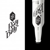
INSPIRATION: While brainstorming I was thinking about the way to make something very different from usual wine packaging, while keeping the elegance associated with wine and create something cool and attractive. RB mark is ambigram which is chosen because it is engaging, inviting users to turn it upside down.
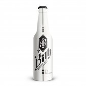
UNIQUE PROPERTIES / PROJECT DESCRIPTION: Rudy & Billy is wine brand that serves wine in a beer bottle. It follows the trend of searching of the alternatives for the beer among young target audience 18-30.
The meaning behind ambigram is - turning wine cliches upside down. It also has the meaning of never being down, because even when you turn it upside down, it is up again. It communicates positivity and encouragement to overcome any problems, invites users to enjoy their life and have fun.
OPERATION / FLOW / INTERACTION: Rudy and Billy is custom made type. While keeping it simple and legible, letter groups udy and ly are connected in unusual way to make it memorable and draw more attention. Chosen angle for type is 45 degrees because wine is best stored upside down between 45 and 0 degrees. The idea is that bottles in stores are placed on the shelf that has 45 degrees holes in. That way the logo on the back is aligned while unusual orientation grabs attention and connects with wine lovers.
PROJECT DURATION AND LOCATION: This project was created in May 2014 in Croatia.
FITS BEST INTO CATEGORY: Packaging Design
|
PRODUCTION / REALIZATION TECHNOLOGY: To be printed on matte plastic shrink wrap.
SPECIFICATIONS / TECHNICAL PROPERTIES: 0,5 liter beer bottle. Diameter 70,0 mm, height 260,0 mm.
TAGS: Luka Balic, wine, beer bottle, bottle, packaging, ambigram, type, typography,
RESEARCH ABSTRACT: -
CHALLENGE: Target group is 18 to 30, trend setters, early adopters, hipsters and surfers, who do not prefer beer but wine is too complicated product for them, too many kinds, its image is too indiferent and too adult.
The packaging had to be practical, designed to make it easy for customers to choose between red and white, and rebelious against wine cliches.
ADDED DATE: 2015-03-07 18:53:15
TEAM MEMBERS (1) :
IMAGE CREDITS: Luka Balic, 2014.
|