Archie Rose Distilling Co. Spirits Range Packaging by Squad Ink |
Home > Winners > #40175 |
 |
|
||||
| DESIGN DETAILS | |||||
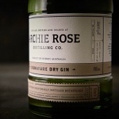
| DESIGN NAME: Archie Rose Distilling Co. PRIMARY FUNCTION: Spirits Range Packaging INSPIRATION: We started our research by exploring local Tasmanian distilleries and the urban distilleries of Brooklyn and London. We discovered that civic pride was a re-occurring theme and with a shortage of heritage sites in Sydney coupled with Archie Rose being the first since 1853, we felt compelled to acknowledge the past. While looking back into Sydney’s distilling history we found a short and sketchy anecdote (as one doesn’t tend to write a lot down when one is distilling illegally) about a small collective of distillers who used the generic name of “Archie” to refer to their distilling comrades, thus providing a degree of anonymity. We felt drawn to this story and thought about how we could breathe new life into the history of Rosebery (the area it’s located) – therefore ‘the Archie’ & ‘the Rosebery’ simply reincarnated as “Archie Rose”. Hence forth, much of our design inspiration was drawn from the past yet we made a conscious effort to ensure the final execution felt contemporary with a nod to the traditional. UNIQUE PROPERTIES / PROJECT DESCRIPTION: Archie Rose Distilling Co. is the first distillery of craft spirits in the City of Sydney, Australia in over 160 years. Archie Rose honours this rich history while offering Sydney-siders the chance to experience genuine grain-to-glass spirit production onsite with an incredible cocktail bar to boot. When our Sydney based design agency Squad Ink was initially engaged to name, brand, package and launch this incredible craft distillery and range of spirits (Gin, Vodka and White Rye as well as matching Tailored Spirits) it was as if our team were handed a Golden ticket to Willy Wonker’s Chocolate Factory. Minds went into overdrive and the creative possibilities seemed endless. We’ve created packaging that is not only beautiful with a fascinating back story but also wonderfully detailed and intriguing in a way that it beckons you to sit down with a bottle and explore every piece of information it offers. OPERATION / FLOW / INTERACTION: Consumers interact with the product in the following sequence. If purchased over the counter the product is encased in a canvas bottle bag. The bottle bag is removed to reveal the product. The extra weight should be instantly noticed from thicker glass on neck and base of bottle followed by the tactile sensation of textured paper with contours of embossing. A three part label provides plenty of interest for the consumer to take in the products information. When ready to consume the tamper seal on bottle is broken at horizontal perforation lines below the cork stopper top. Stopper is removed and the botanical notes in the vodka and gin waft from the bottle mouth. The rest is in the sipping. PROJECT DURATION AND LOCATION: The project ran for 2 years and predominantly took place in Sydney, Australia. FITS BEST INTO CATEGORY: Packaging Design |
PRODUCTION / REALIZATION TECHNOLOGY: We opted for a custom mould, bullet style bottle with a heavy-weighted base. The shape inspired by the impressive copper pot stills at Archie Rose. We also added a 360 degree recessed label indentation across the body so that the full-wrapped belly label could be profiled as a hallmark design feature. We pushed the limitations of short run digital label printing using a large format indigo press were able to provide a cost effective solution for multiple short run releases. Other features such as textured cotton based stocks, detailed embossing and high build varnishes added a luxuriously tactile element to the product. Our intention was to simplify print processes as much as possible ensuring the function-led design wasn’t compromised while communicating quality and authenticity. The tailored spirits range is a bespoke extension of the core range. Consumers can craft their own spirit according to their tastes and this was translated to pack through hand-marked initials of the consumer and a list of botanicals they selected. SPECIFICATIONS / TECHNICAL PROPERTIES: All Bottles are a 700ml volume, made from custom moulded in flint glass. The Dry Gin is finished in deep olive green colour. The Vodka, Dry Gin & White Rye are printed digitally with specials; gloss high build screen, emboss + matte machine varnish on Cotone Bianco. Primary label is 65mm x 280mm and secondary is 19mm x 112mm. Neck labels are printed digital colour with a spot matt varnish on cast gloss adhesive. Size 24 x 140mm The Tailored Vodka, Gin and Whisky are printed digitally with a primary application of opaque white. Specials are unique foils per variety plus a matte varnish on Tintoretto Black Pepper. Primary label is 65mm x 280mm and secondary is 19mm x 112mm. Neck labels are foiled only plus a machine matt varnish. Stopper has a wooden cap of dark 'Mahogony' with an Agglomerated cork TAGS: archierose, distillery, craft, packaging, bottle, label, alcohol, beverage, spirits, squadink RESEARCH ABSTRACT: The strategic foundation involved in depth analysis of the target market, product and packaging trends within the industry and research of established craft distillers in New York and London, such a Sip Smith and New York Distilling Company. Craft distilling is a fairly young and unexplored industry in Australia and almost non-existent in urban areas. For this reason we investigated distilleries abroad, examining their strengths and weaknesses. Archie Rose is an innovative craft distillery and for this reason has the capacity to produce core and limited release spirits. A detailed product map with carefully considered product hierarchy was required to future proof anticipated releases. We also researched naming conventions and ways to create differentiation between spirits. CHALLENGE: The success of the respective label design is a result of the carefully curated content that appears on them. This required an in-depth understanding of the spirit production at Archie Rose and the key ingredients used. For example, the bottle number, date distilled, batch number and spirit style – all hand-marked on each bottle. The challenge was controlling the balance of what the distillers require on the bottle for validity versus what the consumer will find intriguing and compelling enough to instigate purchase. Another important challenge was creating differentiation between spirits – gin, vodka, whisky and basically developing a formula that could be applied to future products. With the Archie Rose logo as the main focus for maximum brand recognition on the bottle, we opted for the title of the spirit to appear in a coloured strip that wrapped the entire belly. This is further reinforced with a separate base label that adopts the same colour. Not only does it provide clear distinction between spirits, but also has a strong graphic presence within a retail environment. For further identification of gin products, we created a custom green tinted glass bottle. The choice of a grassy green tint is reflective of the 14 traditional and rare native Australian botanicals that have been blended together to build its profile. Also in our market analysis we discovered the gin category to be the highest growth area, so it was important to hero this product. ADDED DATE: 2015-02-28 00:33:56 TEAM MEMBERS (21) : Client:, Archie Rose Distilling Co., Founder: Will Edwards, , , Agency: Squad Ink, , Creative Direction and Design:, Matthew and Terry Squadrito, , Finished Art:, Christian Andreé, , Copy Writing:, Andrew Georgiou, , Bottle Production:, Rockwood & Hines Glass Co., , Label Production: and Collotype Labels IMAGE CREDITS: Photography by Janyon Photography Video by WW Productions & Meanwhile Outside |
||||
| Visit the following page to learn more: http://www.squadink.com | |||||
| AWARD DETAILS | |
 |
Archie Rose Distilling Co. Spirits Range Packaging by Squad Ink is Winner in Packaging Design Category, 2014 - 2015.· Read the interview with designer Squad Ink for design Archie Rose Distilling Co. here.· Press Members: Login or Register to request an exclusive interview with Squad Ink. · Click here to register inorder to view the profile and other works by Squad Ink. |
| SOCIAL |
| + Add to Likes / Favorites | Send to My Email | Comment | Testimonials | View Press-Release | Press Kit |
Did you like Squad Ink's Packaging Design?
You will most likely enjoy other award winning packaging design as well.
Click here to view more Award Winning Packaging Design.


