DESIGN NAME:
Office Box
PRIMARY FUNCTION:
Office Space
INSPIRATION:
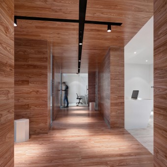
"Box" is a simple element, but it is the maximal value manifestation. It connects each functional area together. It is Enterprise Wall, Leisure Area and also the area for short-time sit, chat and enjoying the nice view. Non-conformity design could make the users happy while satisfying the function of the office.
UNIQUE PROPERTIES / PROJECT DESCRIPTION:
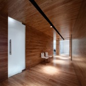
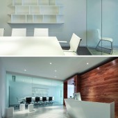
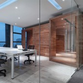
The construction area of the case is 250 square meters. Box, a simple element. But here, it is the largest value field. Closed two irregular box mix into the aisle, connect each functional area. Meeting room use area transparent glass partition wall, appears fully and clear. The whole space is given priority to with white attune, consistent with the company culture, also with lubricious floor the whole package "box" complement each other. Lighting, in the case of satisfy lighting, each lamp cast stones like a casual, casual instead! In short the whole design not conform, satisfy the need of office, and the users can work in cheerful.
OPERATION / FLOW / INTERACTION:
This is a fun office space. The users will first see a huge box cross body when entering into it. Entering into every functional area should be through this box. So it is easy to produce the feeling of inside out. Entering into a functional area, we must get out of the box. And every time we leave an area must be into the box. Long and narrow box links every functional area interestedly to make people use it more efficiently. At the same time, give users the unprecedented spatial experience. Work in such a space should be a very fun thing.
PROJECT DURATION AND LOCATION:
The project started in January 2013 in China Nanjing and finished in July 2013 in China Nanjing
It awarded 2014 Chinese society of interior design office engineering gold medal
FITS BEST INTO CATEGORY:
Interior Space and Exhibition Design
|
PRODUCTION / REALIZATION TECHNOLOGY:
Toughened glass, compound floor, marble,emulsioni paint
SPECIFICATIONS / TECHNICAL PROPERTIES:
250 Square meters
TAGS:
Box,Contracted space,The conceptual design, reverse thinking of the space, refore for both inside and outside space
RESEARCH ABSTRACT:
Office space occupies considerable proportion in our design project. It is of great significance for us to provide each customer different design scheme. This is a design case for medical products supplier. The landlord wants to get a very clean use space. So the color of whole space is not diversification. It is a breakthrough to use a large number of wooden lubricious. Also balance our spatial relations. So we had got a satisfactory answer from the users.
CHALLENGE:
Area is small, but functional requirements is much.
We used reverse thinking of the space, refore for both inside and outside space to solve the problem.
ADDED DATE:
2015-02-24 13:44:50
TEAM MEMBERS (1) :
QING HUA XU
IMAGE CREDITS:
Image #1: Photographer Xiaowen Jin/Sheng Tao, Creator Sheng Tao, Box, 2013.Image #2: Photographer Xiaowen Jin/Sheng Tao, Creator Sheng Tao, Corridor, 2013.Image #3: Photographer Xiaowen Jin/Sheng Tao, Creator Sheng Tao, Office area, 2013.Image #4: Photographer Xiaowen Jin/Sheng Tao, Creator Sheng Tao, Conference room and front desk reception area, 2013.Image #5: Photographer Xiaowen Jin/Sheng Tao, Creator Sheng Tao, Office area, 2013
|


