DESIGN NAME: La Gondola bio
PRIMARY FUNCTION: Card Box
INSPIRATION: puzzle, nature, ecofrendly
UNIQUE PROPERTIES / PROJECT DESCRIPTION: Ecofriendly and environment concern look, using the recicled side of the card.
Reducing costs and ink wastes.
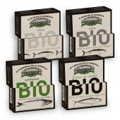
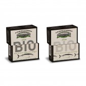
We used 2 faces of the cardbox like a puzzle to make a bigger display and created somme interaction with the consumer (puzzle).
The client whated diferent languages so we did not put all languages in the same packaging but use the printing plan with diferent language packaging.
OPERATION / FLOW / INTERACTION: Normaly the client whants to have all langues possible in the cardbox, so he can sells to all different countries without making new packaging. What makes a very confuse and requires to use all available space for this obligatory information, and we whanted to use 2 faces to make the puzzle efect.
So we came with the idea of not puting all languages in the same packaging but use the printing plan with diferent language packaging.
Using diferent color and shads in the bio letring (the puzzle) the consummer can easely choose the diferent fish.
PROJECT DURATION AND LOCATION: stardted in June 2013 finished April 2014
FITS BEST INTO CATEGORY: Packaging Design
|
PRODUCTION / REALIZATION TECHNOLOGY: We coud not change original diecut because of all problems and costs increases. So to make a diference we did 2 small changes to make this packaging diferent of all the others in the market. We reversed the usual card, did not use the white side of the card, so it would show the recicled paper, giving strength to the bio concerned product that we were presenting.
SPECIFICATIONS / TECHNICAL PROPERTIES: 110mm x 64mm x 25mm
TAGS: Fish, Can, Sardines, Tuna, Mackerel, Bio, Biologic,
RESEARCH ABSTRACT: We looked for recicled card for the box, so we have eco look.
We reduced costs and ink wastes by just using 2 colors.
To have a bigger BIO letring we used 2 faces, using the puzzle idea
The client whated diferent languages so we did not put all languages in the same packaging but use the printing plan with diferent language packaging. we went to printer factury to learn wow we coud use the ptinting pland and die cuts.
CHALLENGE: Portuguese can fish industry is still a little old fashioned, and not very opened to new ideas. They like to have all information in evey language possoble so they can sell to any contry with out spending more mony.
They like to have a diferent color for each product and because there can be a big variety of of flavours and tipes of fish it is dificult to make them easy to make the diference betwin all. And have a clean eco mothern look.
ADDED DATE: 2015-01-30 13:48:05
TEAM MEMBERS (1) : Ana Lisa Luças
IMAGE CREDITS: Ana Lisa Luças, 2014.
|