Quietness Residence by Shin-Yuan Fang |
Home > Winners > #38392 |
 |
|
||||
| DESIGN DETAILS | |||||
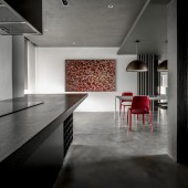
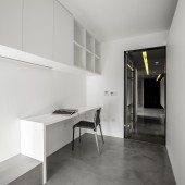
| DESIGN NAME: Quietness PRIMARY FUNCTION: Residence INSPIRATION: The dialogue among the shadow, materials and saturation is so straight-forward and pretentious, and that brings it all back to the nature. The implication between the vertical and horizontal insinuates the harmony and goes way back to the original thought. UNIQUE PROPERTIES / PROJECT DESCRIPTION: The 1/3 and 2/3 concept is applied to the space structure and configuration, which divides the space into public and private areas. The loft is pretty much in the DNA of this living space, and colors of grey and white shades are utilized based on the 1/3 concept for the overall tone. With the whole space divided into 1/3 and 2/3 ratio, each space is intrinsically connected to each other. The use of virgin materials adds to the layer of the space, while the primitive simplicity of cement forms a contrast with the subtle elements in the space. It is a beautiful contrast that blends into a sense of calmness and elegance and in a way, “Zen”. OPERATION / FLOW / INTERACTION: - PROJECT DURATION AND LOCATION: The project started in November 2013 in Shanghai China, and finished in July 2014. FITS BEST INTO CATEGORY: Interior Space and Exhibition Design |
PRODUCTION / REALIZATION TECHNOLOGY: Pandomo, wood, marble, iron, black brick, cement SPECIFICATIONS / TECHNICAL PROPERTIES: Site area: 210 sq.m TAGS: Quietness, Calm RESEARCH ABSTRACT: Symmetric or even proportion with a hard and soft base contributes a structural aesthetic that combines buildings and the cities, literature and life. The metaphor for texture results in rational consciousness. CHALLENGE: For a dweller who often travels alone overseas, the pursuit of quietness is the focus of this project. ADDED DATE: 2015-01-23 10:34:10 TEAM MEMBERS (1) : IMAGE CREDITS: Photographer JMS |
||||
| Visit the following page to learn more: http://www.lw-id.com | |||||
| AWARD DETAILS | |
 |
Quietness Residence by Shin-Yuan Fang is Winner in Interior Space and Exhibition Design Category, 2014 - 2015.· Read the interview with designer Shin-Yuan Fang for design Quietness here.· Press Members: Login or Register to request an exclusive interview with Shin-Yuan Fang. · Click here to register inorder to view the profile and other works by Shin-Yuan Fang. |
| SOCIAL |
| + Add to Likes / Favorites | Send to My Email | Comment | Testimonials | View Press-Release | Press Kit |
Did you like Shin-Yuan Fang's Interior Design?
You will most likely enjoy other award winning interior design as well.
Click here to view more Award Winning Interior Design.


